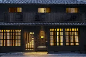
Continuing on somewhat from last week’s post on the filtering functions of the building envelope, here I would like to consider the Japanese koushi: the timber lattice covering the (usually front) windows of Japanese townhouses.
View of the street through the koushi from within the entrance of a townhouse.
View of a koushi-covered facade at night.
The koushi is a great example of the ‘subspecies’ that arise within any element or ‘species’ of vernacular architecture, evolving over time via a process of functional and regional differentiation. The generic koushi has several basic functions: to provide security against forced entry, and to grant the inhabitants some privacy from prying eyes (although privacy was not really a concept in pre-modern Japan, nor one for which the Japanese language even had a word: today they use the English transliteration puraibashii). Aesthetically, koushi provide a sense of verticality to windows that are generally in a ‘landscape’ orientation, and adds rhythm and fractal detail to an otherwise fairly unornamented facade.
A fine koushi showing one of many patterns of cutting the ‘slats’ short at the top to admit more light without compromising on privacy.
Koushi consisting of alternating stout, full-length members with shourter, finer members.
Machiya townhouses containing valuable commodities like alcohol (sake) had the stoutest koushi, called sakaya ‘sake shop’ koushi. Likewise, rice shops (komeya) had komeya koushi, with thick, roughly dressed members that could withstand impacts from wayward barrels of rice and shrug off any scratches and dents. Charcoal shops (sumiya) had sumiya koushi, with very wide, closely-spaced slats, to prevent breezes and drafts from stirring up carbon dust inside the shop. Silk-weaving premises (itoya) and other industries involved in precision craftwork had thin, widely-spaced itoya koushi, to allow in as much light as possible.
Examples of some of the most common types of koushi. From left to right: itoya koushi, sumiya koushi, sakaya koushi, and komeya koushi.
Koushi have become something of a lazy cliche or trope in modern architecture, both in Japan and the West. A common modern abuse or misuse of koushi is to use them in front of blank walls, or to partially obscure things which would be better off completely hidden. Traditional koushi draw the eye and entice the attention because they are always in front of something worth looking at, i.e. a garden (possibly welcome attention), or a front room (probably unwelcome). Modern ‘decorative’ koushi on blank walls would have baffled carpenters of old.
A modern Japanese example of koushi: frameless; consisting only vertical elements all identical in length, dimension, and setback; and arbitrarily covering both windows and blank wall.
Modern or modernist koushi are also almost always without a perimeter frame and lacking any of the subtlety imparted by varying the length, dimensions, or setback of the vertical members. There are aesthetic (“It looks more sleek and modern!”) and no doubt economic motivations for this simplified form, and it can be effective, but rarely.


