TRADITIONAL DESIGN IV - PUSHING AND PULLING PART 2

Following on from last week’s post on Salingaros’ ‘push-pull’ model of generating fractal structures in architecture, here we will consider the implications of this conceptual framework on architectural design, particularly with regards to horizontality and verticality.

As discussed, the model combines the two axial forces, tension and compression, with two orientations: vertical and horizontal. Creating a matrix of these forces and elements would suggest a total of four possible combinations; however, Salingaros only considers three of these combinations valid in the context of architectural design: horizontal tension, which creates vertical perforations; horizontal compression, which creates vertical folds; and vertical compression, which creates horizontal folds or bulges. That vertical tension has been omitted is not an arbitrary decision or an accidental oversight: it is because, in Salingaros’ view, vertical tension expresses an unstable and unnatural ‘anti-gravity’ state; there is no natural force or mechanism that can act on a building to produce vertical tensile stress. In other words, there are biological and biophilic constraints on the push-pull model: we are an upright animal, and our physiology orients us vertically (all vertical really means is ‘along the line that gravity acts’), perpendicular to the horizon. We evolved under the force of gravity, and we possess an internal model of it, an ‘instinct’ that tells us that a vertical pull is somehow ‘off’ or ‘wrong’.

It follows from this that the horizontal perforations (such as horizontal windows) resulting from vertical tension are also unnatural, and produce anxiety in the observer. Vertical tension breaks the facade of a building, cutting and separating it into horizontal windows, spandrels, and slabs. Salingaros references the philosopher Roger Scruton’s observation that most modern buildings are just stacked horizontal slabs, with the archetypal example being the multi-storey parking garage.

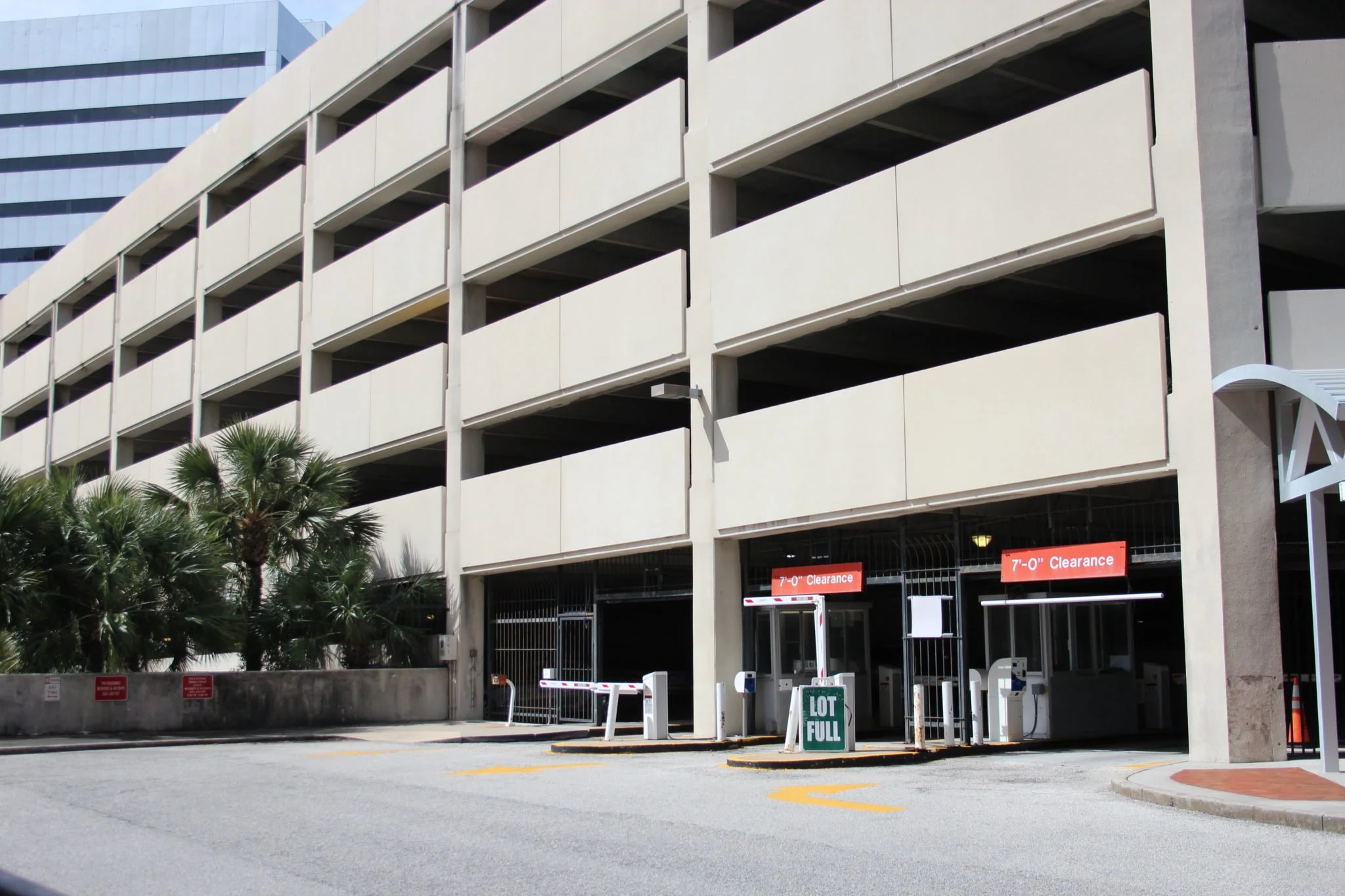
Both the parking garage in the foreground, and the office building in the background, display the anxiety-inducing horizontal perforations that result from the ‘vertical pull’ model of designing a building.

It is something to ponder that of the four possible combinations of axial force and orientation, it is the one that is most antithetical to nature, the most anxiety-inducing, that has become dominant and ubiquitous in architecture today. The esteemed modernist architect Le Corbusier was instrumental in this development; in particular his Dom-ino House (1914-15), which formed the conceptual basis of his output over the following decade, has proved to be immensely influential on subsequent approaches to architectural design.

Le Corbusier’s Dom-ino House

Lifting the ground plan upwards to create the building, in a kind of copy-paste process, destroys the possibility of three-dimensional design. The ‘vertically stretched’ building, with its facade of horizontal elements, is in effect a two-dimensional object, and cannot be related to by humans in any natural way; it is not really designed but rather pulled into existence, in a process akin to unpacking a Chinese lantern.

Chinese accordion lantern

It is telling that even buildings designed according to the contemporary ‘parametric’ methodology, while no doubt considered sculptural by their designers, cannot escape this ‘Chinese lantern’ quality, or the sense of being fundamentally horizontal and two-dimensional.

A generic example of a contemporary building that, for all its heavy-handed cleverness, is still just a stack of horizontal slabs.

The superficial facade treatment cannot disguise the fundamental two-dimensionality of the building.

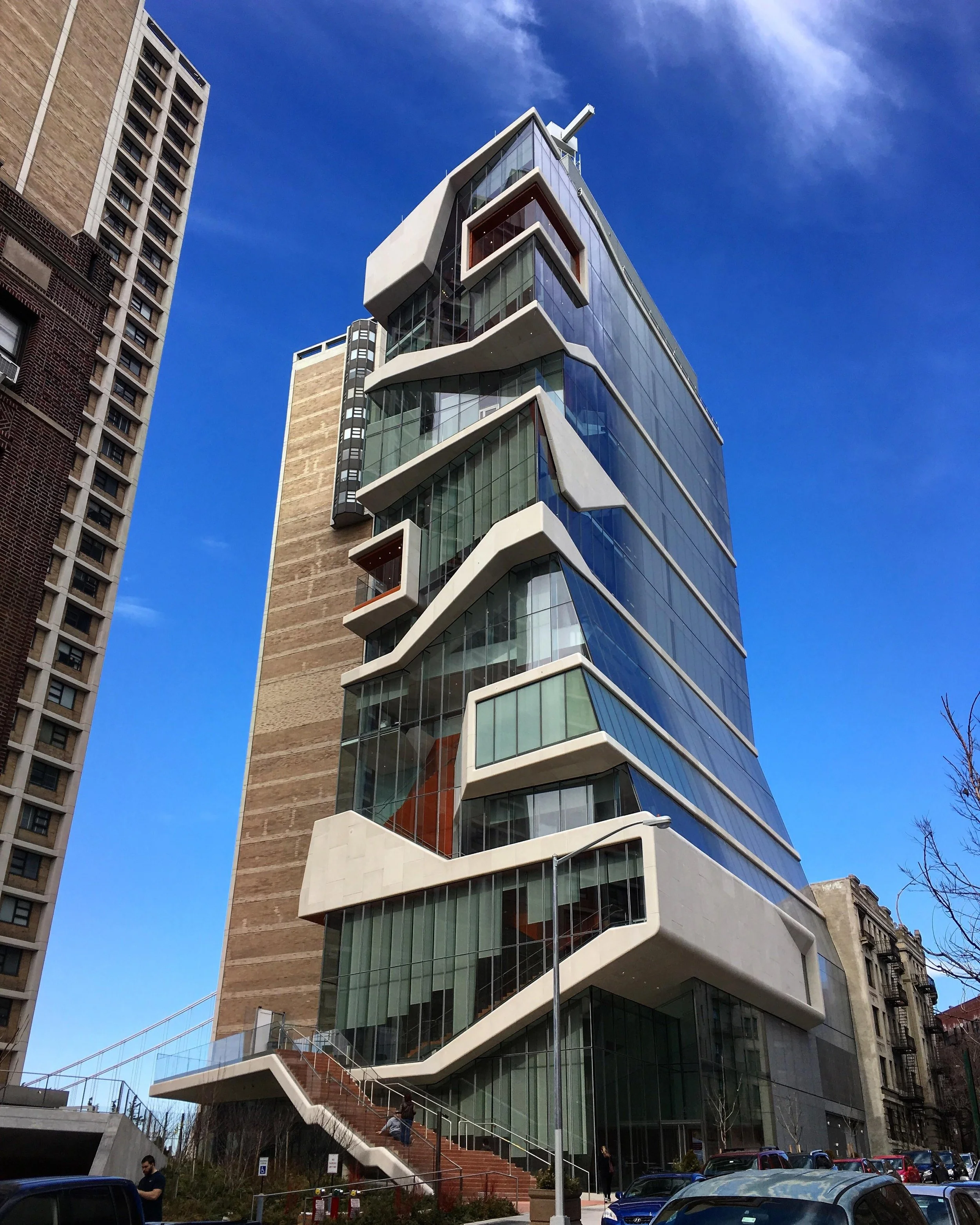
The designers of the earliest skyscrapers, in contrast, by working within a traditional design paradigm, were able to produce buildings of genuine three-dimensional, sculptural quality, with a dominant sense of verticality to their facades.

Example of an early ‘skyscraper’ displaying a strong sense of verticality.

The massing of the overall form, articulation of the facade, and window proportions of this early skyscraper combine to give it a strongly vertical character.

An intriguing ‘hybrid’ or ‘transitional’ example: the overall form is convincingly three-dimensional and suggestive of the vertical, but the proportions and repetition of the windows allow the horizontal to dominate, resulting in a somewhat dissonant and unsettling overall effect.

Vertical tension can even seem to pull the building right off the ground, the connection only maintained by minimal supports called pilotis, which, within the framework of the push-pull model, are not true columns but slim members that seem to by trying to efface their own supporting role and make it appear that the building is floating above the earth, away from the human realm. The piloti is in a sense the opposite of the column: whereas columns are compressed cylinders; thickened at capital and base and fully expressive of their role in supporting the building under gravitational load, pilotis are stretched cylinders, seemingly narrowed by a vertical pull.

The novelty ‘floating’ and ‘cantilever’ effects made possible by the piloti have been much sought after by architects and lauded by critics, but in Salingaros’ view this is a perverse and artificial attitude that one must actively work to convince oneself of, via long immersion in Critical Theory and academic propaganda.

Le Corbusier’s Villa Savoye, perhaps the archetypal example of the use of pilotis in modern architecture.


TRADITIONAL DESIGN III - PUSHING AND PULLING PART 1

This is the third in a series of posts exploring the ideas of the mathematician and design theorist Nikos Salingaros, and by extension those of his collaborator, the architect Christopher Alexander.

The first and second posts in this series covered Nikos Salingaros’ theories on fractals and fractal scaling in architecture. Here we will build on this foundation by looking at Salingaros’ exploration of how fractal structures are generated, via his analogical ‘physical’ model.

The basic model Salingaros proposes is the ‘push-pull’ model, which incorporates the two axial forces of tension (pulling) and compression (pushing), and their respective effects, perforation and folding, to account for how various architectural (and fractal) elements are generated in architecture. The role of bending forces and processes, in generating ‘boundaries for space’ such as curves and domes, is touched upon but not in great detail, so will not be covered here. Nor does Salingaros consider shear in relation to architecture, and it would be interesting to explore the possibilities of incorporating this force into his models.

Perforation, like the theoretical example seen in the Sierpinski gasket discussed in the previous post in this series, is the process of generating openings in a surface. In architecture, perforation results in windows, doors and other openings. Perforated elements have the property of semi-permeability; they let some elements through and prevent others from passing. Salingaros gives the example of the bollard, which permits pedestrians but blocks cars.

Perforations are generated by tension. Imagine a strip of rubber coated with sealing wax. If you pull on both ends of the rubber strip (i.e. apply tension), the wax will crack at regular intervals along the length of the strip - first into larger pieces, then each larger piece into smaller and smaller pieces. Note here that these cracks or ‘perforations’ are oriented perpendicularly to the axis of the tensile force - the importance of this point will become apparent in the next post in this series. Applying this analogy to architecture, we see that if we metaphorically ‘pull’ a wall horizontally, it will perforate into vertical openings - firstly windows and doors, and then, if we keep pulling, the wall will further separate out into arcades, then columns.

Diagram by Nikos Salingaros illustrating the process by which increasing horizontal tension creates first windows, then arcades, then columns.

Folding, by contrast, is the process of generating elements like folds, meanders, thickenings, hollows, and bulges by applying compression. Whereas perforation removes material from a plane, to fold is to fill space: ‘folding the line is the first step to filling the space slightly’. Architecturally, folding finds expression in articulating elements like pilasters on a wall, the capital, base, and fluting of a column, and thick door and window frames. Salingaros also gives the example of alcoves in a temple wall.

An alcove in a wall, flanked by pilasters.

Again, note for later that compression creates folds that are oriented perpendicularly to the axis of compression, so horizontal compression creates vertical fold lines, and vertical compression creates horizontal elements, like the ‘bulging’ of a classical column at its head and base.

Diagram by Nikos Salingaros illustrating the process by which increasing horizontal compression creates folds in a plane at successively smaller intervals and scales.

Classical columns embody the effect of vertical compression: bulges at the head and base, and entasis of the shaft.

From a structural perspective, folds create strength or stiffness in a material by moving parts of it away from its central axis; this is why steel sheeting is corrugated. Salingaros points out that a floor with beams exposed on its underside is visually expressive of the same idea: the beams can be regarded as the locations of strengthening ‘folds’ in the plane of the floor.

From a structural perspective, the beams in the floor plane are equivalent to the corrugations in a sheet of corrugated iron.

In the next post, I will consider the implications of Salingaros’ push-pull model on approaches to architectural design, in particular in explaining the traditional emphasis on verticality over horizontality in architecture, which, as Salingaros demonstrates, is not merely a superficial stylistic preference, but has an objective basis in physics and evolutionary biology.


TRADITIONAL DESIGN II: UNIVERSAL DISTRIBUTION

This is the second in a series of posts exploring the ideas of the mathematician and design theorist Nikos Salingaros, and by extension his collaborator, the architect Christopher Alexander.

The previous post in this series examined the idea of a universal scaling hierarchy and how it could assist designers in deciding how many scales should be employed in buildings, and what the ratios between them should be.  This post and the next will consider the concept of universal distribution, as a way of answering another important question: how ‘full' should each scale be? or how many elements should each scale in the hierarchy contain? 

Imagine you set out to design a tree. While universal scaling is concerned with how big the 1st order branches should be in relation to the trunk, how big the 2nd order branches should be in relation to the 1st order branches, and so on, universal distribution is concerned with how many branches should be on the tree, and how many twigs, and how many leaves.

A good place to begin exploring universal distribution is by looking at the structure of fractals.  For our purposes, a fractal is any pattern that is generated recursively, and has the property of scaling symmetry: it is self-similar at various scales, meaning that you can zoom in on any part of the pattern and it will look identical or near-identical to any other level of magnification, and will contain the same amount of detail.  Fractals also have the interesting property of fractal dimensionality, but this property is less relevant to our purposes. 

One of the simplest fractals is the Koch snowflake.  Starting with an equilateral triangle, add to it three triangles with sides 1/3 the length of the original (meaning the scaling factor is 3); to the sides of these triangles add nine triangles with sides 1/3 their length; and so on.

The Koch snowflake

The Koch snowflake


Another simple triangle-based fractal is the Sierpinski gasket. In a sense it is the inverse of the Koch snowflake: it is subtractive (‘perforated') where the snowflake is additive (‘accretive'), and' ‘ingrown' where the snowflake is ‘outgrown.'  Also, the scaling factor here is 2, not 3.  Neither of these factors are very close to 2.72, which was proposed in the last post as a good approximation of the universal scaling hierarchy, but this doesn’t matter here: we are using fractals not to prove a point about universal scaling (we could easily create a fractal with a scaling factor of 2.72 if we wanted), but to introduce the concept of universal distribution.

 
The Sierpinski gasket

The Sierpinski gasket


The distribution of elements in the Sierpinski gasket is as follows:

0th order scale:  1 element

1st order scale: 3 elements

2nd order scale: 9 elements

3rd order scale: 27 elements

4th order scale: 81 elements

The distribution factor in this case is 3, i.e. each scale contains three times the number of elements of the previous scale.

As with the Fibonacci sequence (also recursive), fractals are everywhere in nature: trees and river systems are familiar examples.  People find these recursive, scale-symmetrical structures inherently pleasing, because they generate just the right amount of information compression in the brain: they are neither monotonous, like a grid of triangles all of the same size, nor chaotic, like a field of triangles of random size, position, and rotation.  The former possesses the necessary quality of order, but has no sense of life; it doesn't contain enough complexity to hold the mind's attention.  The latter produces a sense of anxiety, because the mind cannot derive any rules or patterns from it to reduce the computational load.  The objects and environments that give us the greatest satisfaction occupy a ‘Goldilocks zone' between these two extremes.  They exhibit scaling coherence: they have structures at different scales, a scaling hierarchy, and a high degree of self-similarity at different ‘magnifications.' Neither simplistic nor chaotic, they stimulate the mind without overwhelming it.

How does this apply to buildings?  Consider the baroque facade of Santa Maria in Vallicella, Rome.

Santa Maria in Vallicella, Rome

Santa Maria in Vallicella, Rome

There are bare areas devoid of detail, and within these areas there are centres of focus where the detail is concentrated, particularly around the parts of the facade where one's attention is naturally directed, such as doors and windows (incidentally, but not coincidentally, the human face displays the same kind of detail distribution: bare areas such as the cheeks and forehead, and smaller areas of concentrated, expressive detail, such as the mouth and eyes).

The facade of the gothic/romanesque Siena Cathedral shows a much denser distribution of detail typical of much gothic architecture - its distribution factor is higher than that of Santa Maria in Vallicella - but even here there is a hierarchical arrangement of blank areas and areas of greater detail.

Siena Cathedral

Siena Cathedral

Now let’s look at some pathological examples of universal distribution, or rather its lack.  Take a textbook example of ‘high modernism,' the Villa Savoye by Le Corbusier.

Villa Savoye

Villa Savoye

The facade contains only a few large scales; it is almost completely devoid of small-scale details, and the mid-range scales are absent.  The result is flat, barren, and unnatural; the building lacks the characteristics of universal scaling and distribution found in nature.

The lifeless character of ‘white box modernism’ was recognised as a problem, at least implicitly, by the post-modernists and deconstructivists, but in rejecting high modernism without understanding the root cause of its shortcomings, they only fell into another set of problems.  The facades below are representative. They contain only one scale, or perhaps not even that. Are they all detail, or all blank?  There is no hierarchy, only monotony.  In the end, the effect is every bit as dead as the modernist deadness these contemporary architects were presumably seeking to avoid.

thebarcodeproject.jpg
timber facade.jpg
officeelf.jpg


TRADITIONAL DESIGN I: UNIVERSAL SCALING

This is the first in a series of posts exploring the ideas of the mathematician and design theorist Nikos Salingaros, and by extension those of his mentor and collaborator, the architect Christopher Alexander.

introduction

Buildings, like biological organisms, are organized at a number of different scales, from the largest (the overall dimensions of the building) to the smallest (the texture of the sand in a render coat). This fact presents the architect or designer with a choice: he may either explicitly address it, and attempt to answer the questions and challenges it raises in the design process; or he may choose to ignore it and evade its challenges entirely; either way, his choice will be evident in the results.

How many scales should a building contain? What should the ratios between them be? How many elements should each scale contain? And what should the ratios between the number of elements in each scale be? All of these questions point to a deeper issue: why are some buildings so beautiful and seem so healthy, while others are so ugly and pathological?

This and subsequent posts will try to answer the above questions via an exploration of the ideas of Nikos Salingaros, with the aim of outlining a simple and practical methodology that can might be useful to anyone whose interest is in designing buildings that are beautiful and healthy, rather than ugly and sick.

the universal scaling sequence

You are probably familiar with the Fibonacci sequence, where each number in the series is the sum of the previous two numbers, beginning with 0 and 1:

0, 1, 1, 2, 3, 5, 8, 13, 21, 34, 55, 89, 144, 233, 377 . . .

From this we can derive another sequence, more relevant to our purposes, called the universal scaling sequence, which is obtained by removing alternate terms from the Fibonacci sequence:

1, 3, 8, 21, 55, 144, 377 . . .

The universal scaling sequence can be applied to architectural design in the following way: assign the arbitrary size of 1 to the largest scale in a building, then to the next scale down in size (in the same linear dimension) assign the value 1/3, then 1/8, then 1/21, and so on.  Or, start at the other end and assign to the smallest scale in a building the arbitrary size of 1, then the next scale up in size should be 3, then 8, then 21, and so on. 

To see how this works, try the following: start with a blank building facade with an overall height of 10m, which is your ‘first-order’ or ‘1’ scale.  From this, the sequence might suggest a floor-to-floor height of 10m/3 = 3.33m, a window height of 10m/8 = 1.25m, an ornamental cornice height of 10m/21 = 475mm, a sill or window frame height of 10m/55 = 180mm, and finer ornamental details at 10m/144 = 70mm and 10m/377 = 25mm.  Now do the same for the horizontal dimensions.  Say the facade is 6m wide: 6m/3 = 2m, 6m/8 = 750mm, 6m/21 = 285mm, 6m/55 = 110mm, and 6m/144 = 40mm.  Using these figures, I drew the facade below in about 15 minutes, letting the scales determine the design without much input from my ‘individual creativity.’

test Model (1).jpg

It’s nothing special, but that’s the point- designing in this way is highly forgiving.

Interestingly, if you take any term from the Fibonacci sequence and divide it by the previous term (e.g. 233/144), the number obtained approaches the famous golden mean, 1.618, as the two terms get larger.  Likewise, if you divide any term from the universal scaling sequence by the previous term, the answer approaches 2.618, which is the square of 1.618. However, because the Fibonacci sequence is not a true geometric sequence (where each term is the nth power of the previous term), it is impractical to use it in most design situations.  Nikos Salingaros proposes the natural logarithm e, 2.718, as an acceptable geometric substitute.

 
The Fibonacci sequence in nature

The Fibonacci sequence in nature

A logarithmic spiral in nature

A logarithmic spiral in nature

These constants are not just arbitrary abstractions: they are found throughout the natural world (hence the name universal), from spiral galaxies to molluscs to the number of petals on flowers.  Their great aesthetic and mathematical appeal sometimes tempts architects into designing golden rectangles into their buildings, citing the (possibly apocryphal) example of the Parthenon, or designing buildings that look like seashells and other organic forms.  These kinds of applications are over-literal and fundamentally misconstrued.  The real significance of the universal scaling sequence is that it provides a useful tool for checking that a building's various scales (the dimensions of building elements as measured along the same axis) are a reasonable approximation to the ‘natural' hierarchy of the universal scaling sequence, i.e.:

1. Few scales of the sequence are missing;

2. There are no significant scales that fall between the terms of the sequence; and

3. The ratios of adjoining scales are close enough to 2.618, or 2.718. 

Of course, real-world considerations mean that the scales in actual buildings will rarely conform to the mathematical ideal. In practice, the ratios are rounded off into rules of thumb, like the vernacular builder's ‘rule of three’: each scale in a building should be roughly three times the size of the next smallest scale, and 1/3 the size of the next largest.  At any rate, the important thing is not strict adherence to the numbers, but understanding the concept of the universal scaling hierarchy as an ideal to aim for.

Adoption of the universal scaling hierarchy has several benefits: it imposes non-arbitrary limitations on design (limitations are good); it guides the designer in making more effective design decisions; and it aids in the diagnosis of design flaws.  If a building or facade feels too busy, for example, it may be because it contains too many scales that fall between those on the universal scaling sequence.  Conversely, omitting scales from the sequence results in a collapse of the scaling hierarchy and a barren, lifeless appearance. 


Inappropriate spacing of scales and collapse of the hierarchy: only a few large and seemingly random scales are present in this facade.

Inappropriate spacing of scales and collapse of the hierarchy: only a few large and seemingly random scales are present in this facade.

This classical facade presents a full hierarchy of scales, from large (the distance between columns) to small (the width of the dentils in the cornice).

This classical facade presents a full hierarchy of scales, from large (the ‘bay’ or distance between columns) to small (the width of the dentils in the cornice).

Consider another example: a door and its architrave.  If the door is a standard 820mm wide door, universal scaling would suggest an architrave with a width of 820 / 2.718 = 300mm or so.  This might sound excessive, but if the architrave itself is further subdivided (by mouldings, painted or carved patterns, or other ornament) into successively smaller scales in the hierarchy (say 110mm, 40mm, and 15mm), the result is a door with great presence.  Economic realities generally meant that such opulent doors were reserved for classical or civic architecture; in humbler vernacular buildings, architraves were typically around 100mm wide, which skips a scale but is still far more effective in expressing the idea of ‘doorness’ than a modern ‘architectural’ door, which might have an ‘architrave’ as thin as 10mm.  In this case there are three scales missing between the scale of the door width and the scale of the frame width, which is a bit like a tree consisting of a single, massive trunk covered in tiny twigs: our brains cannot ‘span the gap' between the two scales to form a coherent connection between them, and the hierarchy collapses. 


Classical door with ornamented surround

Classical door with ornamented surround

Modern door with "frame"

Modern door with "frame"

Given that the human perceptual system evolved in the natural world, where these scaling sequences and ratios are the literal rule, it should not be controversial to suggest that people have an instinctive affinity for correct scaling ratios, and that buildings designed around a universal scaling hierarchy hold an innate aesthetic and emotional appeal for us, as evidenced by the fact that such buildings are found across all ages and cultures, in both classical architecture and vernacular building traditions.  In fact, as Salingaros points out, there are only two significant exceptions to this universality: one being the ‘death architecture’ of Egyptian Pyramids and defensive fortifications, both of which are deliberately designed to be repellent; and the other being modern architecture.