Animal Architecture is a great book by the German ethologist Karl von Frisch, on the subject of (you guessed it) animal architecture. Von Frisch is probably best known for deciphering the dance of the honey-bee; this book is not one of his academic works, but is intended for the general reader. I highly recommend it to architects and designers- not, mind you, as a collection of forms to be turned verbatim into buildings (the world does not need any more spiral shell floor plans or treelike columns, thanks) but as a source of analogues and guiding principles. I don’t have a copy, but have always remembered one line from it on the topic of scale, which was brought to mind today when driving past the edgy new government building that has recently gone up in my town: a monolithic, undetailed monstrosity that completely dwarfs not only the people below it but also the existing buildings around it. The line goes something like: “The hummingbird does not build his nest out of branches, nor the eagle his of gossamer.”
WHAT HAPPENED TO COLOUR?
Is our era the most monochrome in Australian architectural history? Light gray-dark gray-white, and other equally drab exterior colour schemes, have held sway here for years, and show no signs of going away any time soon.
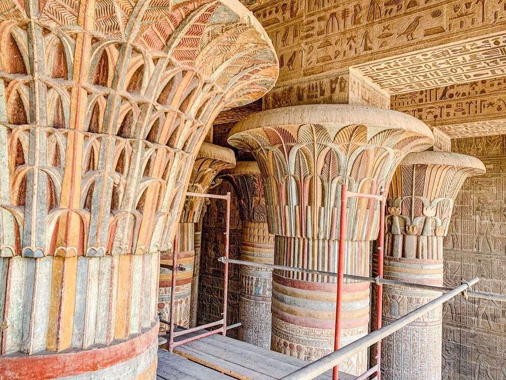
Most people know by now that ancient Egyptian, Greek, and Roman buildings were a riot of colour:
Egptian columns
Reconstruction of a polychrome Greek temple
As were Gothic cathedrals:
Gothic clustered columns
Even Victorian and Federation vernacular buildings, though their builders had only a limited range of relatively subdued natural (and a few synthetic) pigments to work with, seem positively joyous compared to our desaturated modern streetscapes (but good luck finding a house from those periods that hasn’t been ‘refreshed’ to look ‘contemporary’).
Period Federation colour scheme
Probably a big part of the motive here, for both developers and home owners, is the same as that behind the fact that the vast majority of vehicles are white, silver-grey, or black: the desire for ease of resale. Houses are now painted not to present the individuality and taste of their long-term owner to the street, but to be as bland and inoffensive as possible, with one eye to flipping them for a profit a few years down the track.
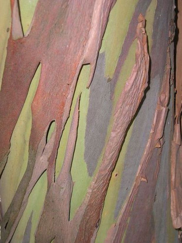
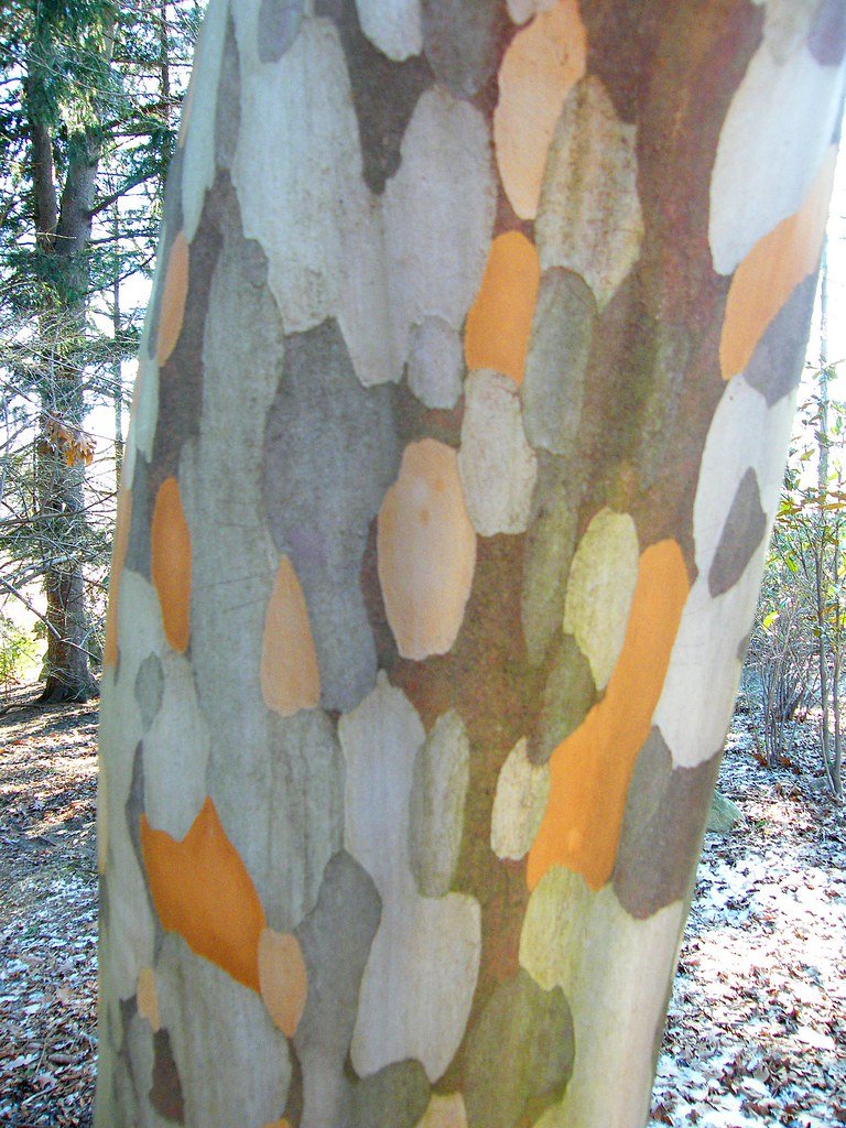
This is a great pity, especially in the emphatically not-grey country of Australia, where a short walk in the bush will provide you with endless colour ideas, and where you could spend an entire career working only with the palette found on a single parrot or eucalyptus tree.


