BUILDINGS WITH FACES

There is an idea sometimes encountered in modern architectural teaching and theory that it is somehow inauthentic or ‘fake’ to put more design effort, expense or ‘weight’ into the facade of a building than into the other sides; indeed, that a building shouldn’t even have a recognisably dominant side, but should rather be regarded and designed as a sculpture whose full profundity can only be grasped by a 360 degree walkaround. The paradigmatic example would be a building like Le Corbusier’s Ronchamp Chapel.

Ronchamp Chapel by Le Corbusier

Traditional buildings in such parklike settings, in contrast, whether cathedrals or country mansions, were always designed with a recognisable front. It was considered self-evident that buildings should have ‘faces’ just as people do, where expression and character are concentrated.

Villa Foscari by Palladio

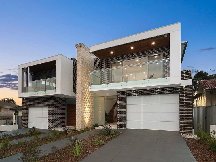
At any rate, sites that allow buildings to sit visually unencumbered by any neighbouring structures have always been relatively rare, and are almost nonexistant in urban residential neighbourhoods. There is nothing inauthentic about putting more design time and money into a street facade, for example by using more expensive timber-framed windows only in the facade, and cheaper aluminium framed windows elsewhere. In fact, the classing of bricks into ‘common’ or ‘face’ varieties arose from this practice of favouring the front: the finest, most uniform and blemish-free bricks were graded ‘face’ quality, for use in the facade, and the rest ‘common,’ to be used on the back and sides of the building. Though the terms face and common brick survive to this day, the consistency of modern brick manufacturing has made the distinction almost meaningless, and the colour variation and visual interest displayed by ‘common’ brick is ironically often regarded as equally if not more attractive than the perfection and uniformity of ‘face’ brick, and used over the entire house.

The desire to give a building a pretty face should not be understood merely as an aesthetic custom or preference. It also has deeper social importance- it is a gesture to the street, and by extension symbolic of a willingness to engage with the public realm and the community.


TECHNOLOGY AND TRADITION

The period from the beginning of the industrial revolution through to the early 20th century is fascinating for the way in which architects and engineers were able to successfully adopt novel building methods, typologies, technologies, and above all materials - cast and wrought iron and later steel, Portland cement and reinforced concrete, and large panes of glass - into their buildings. But because they integrated these elements seamlessly into the unbroken lineage of traditional and even classical design idioms, rather than employ them in ‘radical’ ‘innovative’ and ‘challenging’ design ‘approaches’ as would be expected today, this long, fecund period has been somewhat memory-holed. Though it fits well into the history of building technology, in ideological terms it is on the wrong side of ‘year zero’ (whenever you define that to be) and it sits uneasily with the dominant contemporary narrative - that the current moment is somehow ordained; that the Modern is superior to the traditional and even represents a kind of ascent to a higher plane; that the break with and ‘leaving behind’ of the traditional was somehow inevitable and even morally necessary; that technological progress must necessarily go hand-in-hand with Progress as ideology, Progress in Theory and Progress in aesthetics; and that progress in such things is even possible.

Rather than be disheartened by the decoupling of material technology from traditional design, however, we should instead view the achievements of this period as a cause for optimism- after all, if it was done once, why shouldn’t it be done again?


KON WASUJIRO AND FUDO

Kon Wajiro (1888 – 1973) was a Japanese architectural scholar and folklorist who pioneered the sociological field of what he called ‘modernology’ – the study of how people and their environments change and adapt in response to the processes of modernisation. 

Kon was already well established in his study of rural farmhouses and folklore by the 1920s; his research into their urban equivalents was spurred by the Great Kanto earthquake of 1923, which laid bare the lives of Tokyoites in a very literal way and allowed him to observe how they lived and sheltered themselves among the ruins. 

Kon often made use of the term fudo (風土) in his writings, which literally translated means “wind and earth” but is usually defined as something like ‘the natural conditions and social customs of a place’.  Kon took the term to encompass the totality of the ‘folk environment’- not just conditions and customs of a particular human environment, but also the physical objects: the clothes, tools, utensils, furniture, and so on.  He regarded the house, its occupants, and its objects, contained by the house and used by the occupants, as parts of a single holistic system in which all these elements interacted.  

Kon would probably be less well-known today were it not for the thousands of charming drawings and diagrams he produced over the course of his career, examples of which I have included below.


WHAT HAPPENED TO COLOUR?

Is our era the most monochrome in Australian architectural history? Light gray-dark gray-white, and other equally drab exterior colour schemes, have held sway here for years, and show no signs of going away any time soon.

Most people know by now that ancient Egyptian, Greek, and Roman buildings were a riot of colour:

Egptian columns

Reconstruction of a polychrome Greek temple

As were Gothic cathedrals:

Gothic clustered columns

Even Victorian and Federation vernacular buildings, though their builders had only a limited range of relatively subdued natural (and a few synthetic) pigments to work with, seem positively joyous compared to our desaturated modern streetscapes (but good luck finding a house from those periods that hasn’t been ‘refreshed’ to look ‘contemporary’).

Period Federation colour scheme

Probably a big part of the motive here, for both developers and home owners, is the same as that behind the fact that the vast majority of vehicles are white, silver-grey, or black: the desire for ease of resale. Houses are now painted not to present the individuality and taste of their long-term owner to the street, but to be as bland and inoffensive as possible, with one eye to flipping them for a profit a few years down the track.

This is a great pity, especially in the emphatically not-grey country of Australia, where a short walk in the bush will provide you with endless colour ideas, and where you could spend an entire career working only with the palette found on a single parrot or eucalyptus tree.


IN DEFENSE OF (SOME) MODERNISM

As a proponent of traditional design and architecture, I sometimes find myself in the position of wanting to defend the work of certain ‘modernist’ architects against the more strident ‘traditionalists’ on twitter and elsewhere who are as reflexively dismissive of all ‘modernist’ architecture as architectural progressives are of traditional forms. This blanket dismissal suggests to me that these critics haven’t really understood that what makes a building ‘traditional’ in part or whole is the degree to which it displays the underlying principles that constitute the ‘traditional’ in design, and are instead relying on superficial attributes or associations, such as era or style, in passing judgement. I always emphasise that traditional design has nothing to do with historicism or classicism, and that it is perfectly possible to do traditional architecture that is neither.

Traditional architectural principles are broadly hierarchical, and died in stages: first to go was ornament, but lack of ornament isn’t necessarily fatal to a building. Most of the architects of the period of early or ‘high’ modernism, though their work may be shorn of ornament, nevertheless preserved many of the other, arguably more foundational, principles of traditional design that were progressively lost over the following decades: natural materials, a degree of fractal scaling, local symmetries, a careful sense of proportion, plumb walls, rectilinear windows, and so on. Were you to bring them back, most of these architects would be appalled by the sterile, anti-human, parametric horrors of the architect-priests of our own time.

The modern cult of individual creative genius may have been disastrous for architecture as a whole, but that doesn’t mean that such figures don’t exist. And these architects certainly had their failures- the problem with free-floating, intuitive inspiration, as opposed to vernacular or classical design anchored in the communal rules of tradition and so almost infinitely forgiving of mediocrity, is that if the muse deserts you you aren’t left with much. But the best of the work of the best is, to me at least, undeniably beautiful, and represents a self-conscious but successful high-architectural invocation of the spirit of vernacular architecture. You might even, with some justification, call it ‘traditional modernism.’

Alvar Aalto

Alvar Aalto

Alvar Aalto

Gunnar Asplund

Gunnar Asplund

Luis Barragan

Luis Barragan

Jorn Utzon

Jorn Utzon


A MIX OF COMPATIBLE MATERIALS

Over recent years, the idea has taken hold among architects and planning authorities alike that building facades need to display ‘modulation,’ ‘articulation,’ and ‘a variety of materials and colours’. The state of New South Wales seems particularly intrusive in this, going so far as to promote and even mandate these notions in its planning schemes. The Hornsby Development Control Plan 2013, for example, contains the following provisions for the street facades of medium density housing developments (basically townhouses and the like):

  • Articulation should be achieved by dividing all facades into vertical panels. Wall planes should not exceed 6 metres in length without an offset of at least 1 metre and a corresponding change in roof form.

  • Buildings should include structural elements such as sunshades, balconies and verandahs that provide variety in the built form.

  • Facades should incorporate a mix of compatible materials such as face or rendered brickwork and contrasting areas of light weight cladding.

  • Sunscreens and awnings comprised of timber battens or metal frames are encouraged.

It seems that what is being attempted, albeit in a crude and inchoate way, is the reintroduction of some degree of fractal scaling into the streetscape, although it is highly unlikely that the authors of the planning scheme would have described it in these terms. Rather, town planners probably perceived a need to respond to a creeping featurelessness or blandness of the modern developer-driven ‘builder’s vernacular’ without at the same time going to the other extreme of giving free reign to local architects with pretensions of ‘genius’ along the lines of a Gehry or Hadid. The problem they are faced with, probably insurmountable, is how to reconcile these two aims - the avoidance of ‘monotony’ on the one hand, and the imposition of ‘order’ on the other - within the framework of a modern architectural orthodoxy that regards them as contradictory and antithetical.

Traditional design, which is essentially self-regulating, had solved the uniformity/monotony - variety/chaos problem before it even arose. Traditionally, streetscapes displayed a stylistic and material uniformity and harmony within each building, and a degree of variety across different buildings, but each still bound by the constraints of traditional design and materials; today, on the other hand, we have chaotic variety within each building, and a kind of monotonous but equally chaotic sameness across buildings.

The traditional architect had no problem with a long, ‘flat’ facade plane completely lacking in ‘offsets,’ because he knew he could easily avoid a monotonous or oppressive appearance by effectively articulating it on both a wider and a finer range of scales than is typically seen today - that is, by the use of pilasters, string courses, cornices, window sashes with small panes set in muntins and deep window reveals in thick walls, a variety of brick bonds, material textures, and so on. Steps in and out in the facade are typically on the order of centimetres, not metres. Today we start with a flat facade, consisting of flat window frames set close to flush in a flat wall surface made up of flat panels of flat industrial metal and flat industrial brick, and grossly overcompensate by insisting that this facade be arbitrarily stepped in and out by metres, and that materials, colours, roof pitches, etc. be varied equally arbitrarily and randomly, with the aim of somehow providing ‘interest’. Predictably, the result this is that every duplex or townhouse development is essentially indistinguishable from any other: dutiful use of ‘a variety of materials and colours,’ thick square or three-sided ‘picture frames’ of alucobond or fibre cement around balcony openings and garage doors, upper levels cantilevered out over brick lower levels, glass balustrades, and random skillions.

A particular modern favourite is to use two or more different brick colours in large ‘panels’ in a facade. Look at any old brick building, in contrast, and you will rarely find more than one brick colour used; where you do, there is a clear dominant or ‘ground’ brick colour, and the other is the ‘figure’ employed to pick out highlights at corners, around windows, and so on. The variety is in the service of expressing a structural or functional differentiation. It was understood that buildings need to project a sense of visual unity.

19th century townhouses in Millers Point, Sydney. With no variety of materials or offsets in the facade plane, presumably this ‘design’ would not be permitted today.

Hotel in The Rocks, Sydney. The facade displays fine-grained ‘offsets’, ornament, and a subtle variety of colours and finishes, differentiated rationally and functionally.