Lowering the ceiling of a room is not just a way of saving on construction materials and ongoing heating costs; it is also very effective in giving a space a sense ‘cosiness’ or intimacy, especially when a low ceiling is used within, and to give contrast to, a larger space with a higher ceiling, such as a dining nook in a kitchen or bed alcove in a bedroom. Arguably the four poster bed is an example of the latter in furniture form, with the roof of the bed forming a second ceiling below the room’s ceiling. If we permit this interpretation, then perhaps the ultimate in low ceilings and intimate spaces is the ‘box bed,’ once valued in the cold climates of northern Europe for its ability to trap heat, and no doubt also for the feeling of absolute enclosure and security it brought to its occupants.


KITCHEN LAYOUTS
In last week’s post we looked at the idea of applying the kitchen triangle in designing a kitchen, but noted that, while still a useful idea, developments in kitchen design in the 70 or so years since the concept was introduced have complicated things somewhat. In this week’s post we will examine some of these developments, and look at the influence they have had on kitchen design.
Perhaps the biggest change has been that the kitchen has taken centre stage in the social life of the house. With the rise of the informal Living-Dining-Kitchen plan, the importance of the kitchen within this open space has only grown, and so has its size. Often a central consideration in kitchen design is laying out the ‘stations’ of the space in a way that allows social interaction between the person or people doing the cooking and other family members ‘hanging out’ in the space.
One consequence of kitchens getting larger is that the idea of a kitchen triangle is not always applicable. Whereas in the past the kitchen was more or less exclusively the domain of the housewife or even a paid cook, in many modern households there may be multiple people involved in food preparation, and if this is the case the kitchen has to accommodate them - often by dividing the space up into two or more zones, with separate areas for food preparation and/or socialising. The single-wall kitchen, the L-shaped ‘corner’ kitchen, and the U-shaped or C-shaped layouts, though efficient in their use of space for smaller kitchens, are not always amenable to use by multiple people, or to socialising. One way around this is to include a breakfast counter ‘peninsula’ as one leg of the L or U, with high chairs or stools, so people have a place to sit and talk with the person preparing meals/washing up etc.
The gold standard for a ‘social’ kitchen within a larger open plan space is the kitchen island. The island serves as both preparation area and entertainment area, and can be added to a single-wall kitchen to form a ‘galley’ kitchen, or to a corner kitchen. In both cases, the kitchen island opens up the possibilities for using the kitchen socially, by reorienting the space towards the living area, but if space is limited the kitchen island may not be a practical possibility - although you can get away with as little as 1.0m clear distance between your kitchen counters and kitchen island in a single-person kitchen, you need at least 1.2m if the kitchen is to be used by two people at once - enough for them to ‘sidle’ past each other - and at least 1.5m to allow people to pass each other without going sideways.
THE KITCHEN TRIANGLE

The kitchen triangle or kitchen work triangle is a simple rule of thumb useful in kitchen design, first developed by ergonomists in the mid 20th century, who wanted a way of measuring and maximising efficiency of movement (and thus minimising space and thus cost) between the three main centres or ‘stations’ of activity in the kitchen: food storage (the fridge and pantry), food preparation (the sink) and food cooking (the stove/oven). Generally the sink, the most used part of the kitchen, should be in the centre of the arrangement, i.e. between the other two stations. The idea is that if you draw a triangle with one of these three stations at each of its three corners, then the total length of the sides of the triangle should be between four to six metres (some sources cite five to seven metres or other figures). At any rate, anything less than the lower figure probably means your kitchen will be too cramped; and anything higher might suggest that your kitchen is probably going to be too large and you will be spending too much time and effort walking between the three stations.
The kitchen triangle is also useful in making sure that no pedestrian traffic crosses any part of the working space of the kitchen- people going through the kitchen to bedrooms, laundry, etc. should not have to cross paths with or dance around a person using the kitchen. Also, the lines of movement and sight between stations should ideally not be ‘broken up’ with tall cabinets, wall ovens, and the like- there should be open countertop between each station.
As a general rule of thumb, the kitchen triangle is still a valid way of evaluating the basic functionality of your kitchen, even seventy odd years after the concept was first introduced. Of course, each design situation and brief is unique, the kitchen triangle is not appropriate for all kitchens, and these days things like kitchen islands can complicate matters- next week we will look at some of these factors in more detail.
KON WASUJIRO AND FUDO
Kon Wajiro (1888 – 1973) was a Japanese architectural scholar and folklorist who pioneered the sociological field of what he called ‘modernology’ – the study of how people and their environments change and adapt in response to the processes of modernisation.
Kon was already well established in his study of rural farmhouses and folklore by the 1920s; his research into their urban equivalents was spurred by the Great Kanto earthquake of 1923, which laid bare the lives of Tokyoites in a very literal way and allowed him to observe how they lived and sheltered themselves among the ruins.
Kon often made use of the term fudo (風土) in his writings, which literally translated means “wind and earth” but is usually defined as something like ‘the natural conditions and social customs of a place’. Kon took the term to encompass the totality of the ‘folk environment’- not just conditions and customs of a particular human environment, but also the physical objects: the clothes, tools, utensils, furniture, and so on. He regarded the house, its occupants, and its objects, contained by the house and used by the occupants, as parts of a single holistic system in which all these elements interacted.
Kon would probably be less well-known today were it not for the thousands of charming drawings and diagrams he produced over the course of his career, examples of which I have included below.


LOCAL HEATING
Heating the entire volume of a house or room with a fan-forced convection device such as a split-system air conditioner is a very recent luxury. Before gas and electricity, heating was far more ‘local’ to the body, and was usually achieved with a radiant heat source, be that an open fire, stove, or brazier. Then as now, conductive heating was also employed, and at the most local level possible: by using the heat of the body itself to warm the layer of air trapped between it and clothing or blankets.
In the unsealed and uninsulated traditional Japanese house, there were three main ‘stations’ of heat that the inhabitants used to keep warm throughout the day and night: the kotatsu, the bath (heat by conduction), and bed.
The kotatsu is an excellent example of the kind of evolved emergence and holistic integration of parts that is so often found in vernacular ‘design’. It is a low table with a top that sits loose on the frame; between the frame and top is sandwiched a padded futon (here meaning a blanket or quilt rather than ‘mattress’) which drapes down on each side to the floor and is placed over the laps of those sitting at the table, so enveloping their legs in the heated space created between the floor and the futon.

A modern Japanese kotatsu
In the modern version, the heat source is a small electric space heater attached to the underside of the frame. In the traditional version, the hori-gotatsu or ‘sunken’ kotatsu (presumably evolved from the irori, the hearth sunk into the floor of Japanese ‘living rooms’ in farmhouses and elsewhere), there is a pit sunk into the floor that contains a small charcoal brazier and is covered by a grate flush with the floor to protect the legs. In some cases, there is a pit for the legs roughly the size of the table itself and the depth of the lower legs, so users can sit as if in a chair rather than cross-legged; the brazier is contained in a smaller pit within this pit.

Extended family gathered around a farmhouse irori.

The modern kotatsu (top) and the more traditional hori-gotatsu (bottom).
The key to the effectiveness of the kotatsu is in the clothing of those using it: traditional Japanese clothing such as the kimono are open at the bottom, allowing the heat from the kotatsu to rise up into the space between the clothing and the body; the clothing can also be drawn closed or open at the neck to prevent or allow the heated air from escaping as necessary. The kotatsu also forms the locus of the social activity the Japanese call kazoku-danran: sitting together in a family ‘circle’ to eat, talk, play games, and so on. So the kotatsu can be seen as part of a system, a highly satisfying vernacular solution that integrates not only the function of heating with the furniture and the architecture, but also with the clothing, and even with the manner of social interaction.

A birds-eye view of kazoku-danran around the kotatsu
Similar solutions can be found in the west, though perhaps not so sophisticated as the kotatsu. The high-backed, winged armchair, for example, achieved its form for functional reasons in the days before central heating. When faced towards an open fire, the cupping shape of the chair collects the radiated heat; the high back and wings block cold draughts to the head, and the the arms allow a blanket to be more securely draped over the legs.

DESIGN CONDESCENSION

From time to time I come across articles on interior design blogs or in other places where the writer traces the development of a particular aspect of architectural or interior design through its history. In these articles, there is often a faint undercurrent of condescension or superiority, as if to say, ‘haha look at those silly premoderns, luckily we moderns know better.’ This attitude is driven by an underlying assumption of inevitable and endless progress, be it social, material or technological, that confers redundancy on everything that came before the present.
A good example of this is kitchen design. The author will sketch out the history of kitchens, comparing the separated and poky little lean-to kitchens of the nineteenth century unfavourably to the modern ‘open plan’ that is ubiquitous today, and imply bafflement that anybody would have chosen to do it any way other than we do. As an aside, it is stating the obvious to point out that between the two ends of this kitchen design spectrum there are all kinds of in-between ‘semi-open’ design possibilities that allow the best of both worlds, but for whatever reason these possibilities are rarely explored; nor in any case are the eminently rational motives behind the design decisions buried in these old and ‘primitive’ kitchens.
Before electricity and even gas, all cooking was done with wood or coal, and the risk of fire was very real. By separating the kitchen off the back of the house, the risk of a kitchen fire taking out the entire house was reduced, particularly in the case of a brick house where the lean-to kitchen was effectively fire-separated from the main dwelling. Cooking fires also generate a lot of heat, which isn’t necessarily wanted in the rest of the house, especially in an Australian summer.
No electricity also means no mechanical extraction fans, so a separate kitchen was the only way of preventing smoke, soot, oil, cooking smells, and water vapour from permeating the walls and furnishings of living areas.
These are only some of the ‘technical’ reasons for kitchens being the way they were; there are also social factors that I won’t go into here. The point is that the design decisions of past buildings shouldn’t be dismissed as historical or superannuated, but rather taken seriously and even learnt from.
Design, like evolution, has no telos; design features, like the features of biological organisms, simply represent the fittest or best responses to the prevailing conditions of the environment in which they exist. If, as I believe, we are leaving our historically anomalous environment of extreme energy and resource abundance, and re-entering an environment of energy and resource scarcity that is almost beyond living memory in the first world, then we will also witness a reversal of the design ‘progress’ seen by techno-progressives as irreversible, and the re-emergence of many of the design elements, and much of the design wisdom, contained in old kitchens and other spaces.

A MIX OF COMPATIBLE MATERIALS
Over recent years, the idea has taken hold among architects and planning authorities alike that building facades need to display ‘modulation,’ ‘articulation,’ and ‘a variety of materials and colours’. The state of New South Wales seems particularly intrusive in this, going so far as to promote and even mandate these notions in its planning schemes. The Hornsby Development Control Plan 2013, for example, contains the following provisions for the street facades of medium density housing developments (basically townhouses and the like):
Articulation should be achieved by dividing all facades into vertical panels. Wall planes should not exceed 6 metres in length without an offset of at least 1 metre and a corresponding change in roof form.
Buildings should include structural elements such as sunshades, balconies and verandahs that provide variety in the built form.
Facades should incorporate a mix of compatible materials such as face or rendered brickwork and contrasting areas of light weight cladding.
Sunscreens and awnings comprised of timber battens or metal frames are encouraged.
It seems that what is being attempted, albeit in a crude and inchoate way, is the reintroduction of some degree of fractal scaling into the streetscape, although it is highly unlikely that the authors of the planning scheme would have described it in these terms. Rather, town planners probably perceived a need to respond to a creeping featurelessness or blandness of the modern developer-driven ‘builder’s vernacular’ without at the same time going to the other extreme of giving free reign to local architects with pretensions of ‘genius’ along the lines of a Gehry or Hadid. The problem they are faced with, probably insurmountable, is how to reconcile these two aims - the avoidance of ‘monotony’ on the one hand, and the imposition of ‘order’ on the other - within the framework of a modern architectural orthodoxy that regards them as contradictory and antithetical.
Traditional design, which is essentially self-regulating, had solved the uniformity/monotony - variety/chaos problem before it even arose. Traditionally, streetscapes displayed a stylistic and material uniformity and harmony within each building, and a degree of variety across different buildings, but each still bound by the constraints of traditional design and materials; today, on the other hand, we have chaotic variety within each building, and a kind of monotonous but equally chaotic sameness across buildings.
The traditional architect had no problem with a long, ‘flat’ facade plane completely lacking in ‘offsets,’ because he knew he could easily avoid a monotonous or oppressive appearance by effectively articulating it on both a wider and a finer range of scales than is typically seen today - that is, by the use of pilasters, string courses, cornices, window sashes with small panes set in muntins and deep window reveals in thick walls, a variety of brick bonds, material textures, and so on. Steps in and out in the facade are typically on the order of centimetres, not metres. Today we start with a flat facade, consisting of flat window frames set close to flush in a flat wall surface made up of flat panels of flat industrial metal and flat industrial brick, and grossly overcompensate by insisting that this facade be arbitrarily stepped in and out by metres, and that materials, colours, roof pitches, etc. be varied equally arbitrarily and randomly, with the aim of somehow providing ‘interest’. Predictably, the result this is that every duplex or townhouse development is essentially indistinguishable from any other: dutiful use of ‘a variety of materials and colours,’ thick square or three-sided ‘picture frames’ of alucobond or fibre cement around balcony openings and garage doors, upper levels cantilevered out over brick lower levels, glass balustrades, and random skillions.


A particular modern favourite is to use two or more different brick colours in large ‘panels’ in a facade. Look at any old brick building, in contrast, and you will rarely find more than one brick colour used; where you do, there is a clear dominant or ‘ground’ brick colour, and the other is the ‘figure’ employed to pick out highlights at corners, around windows, and so on. The variety is in the service of expressing a structural or functional differentiation. It was understood that buildings need to project a sense of visual unity.

19th century townhouses in Millers Point, Sydney. With no variety of materials or offsets in the facade plane, presumably this ‘design’ would not be permitted today.

Hotel in The Rocks, Sydney. The facade displays fine-grained ‘offsets’, ornament, and a subtle variety of colours and finishes, differentiated rationally and functionally.
21 DESIGN RULES FROM 1855
The following is taken from The Register of Rural Affairs, published in America in 1855. I think it holds up pretty well :)
1. Always compare the cost with the means, before deciding on the plan. It is much better to build within means, than to have a large, fine house, hard to keep in order, and encumbering the owner with a heavy and annoying debt. A great error with many is an attempt to build finely. Attend to real wants and substantial conveniences, and avoid imaginary and manufactured desires.
2. Study a convenient location rather than a showy one: a house on a lofty hill may make a fine appearance, but the annoyance of ascending to it will become greater on each successive day.
3. Build of such good materials as are near at hand. An interesting index is thus afforded to the resources and materials of that particular region, with the addition of great economy over the use of such as are “far brought and dear bought."
4. Prefer lasting to perishable materials, even if more costly. A small well built erection, is better than a large decaying shell.
5. Discard all gingerbread work, and adopt a plain, neat, and tasteful appearance in every part. Far more true taste is evinced by proper forms and just proportions than by any amount of tinsel and peacock decorations. A marble statue bedizened with feathers and ribbons, would not be a very pleasing object.
6. Proportion may be shown in the smallest cottage as well as in the most magnificent palace - and the former should be carefully designed as well as the latter. However small a building may be, let it never show an awkward conception, when a good form is more easily made than a bad one.
7. Where convenient or practicable, let the plan be so devised that additions may be subsequently made, without distorting the whole.
8. More attention should be given to the convenient arrangement and disposition of rooms in constant daily use, that those employed but a few times in the course of a year. Hence the kitchen and living-room should receive special attention.
9. In all country houses, from the cottage to the palace, let the kitchen (the most important apartment,) always be on a level with the main floor. It requires more force to raise a hundred pounds ten feet upwards, whether it be the human frame or an assortment of eatables, than the same weight one hundred feet on a level. To do it fifty times a day is a serious task. If the mistress superintends her own kitchen, it should be of easy access. For strong light and free ventilation, it should have, if possible, windows on opposite or nearly opposite sides.
10. There should be a set of easy stairs from the kitchen to the cellar. Every cellar should have, besides the stairs within, an outside entrance, for the passage of barrels and other heavy articles.
11. The pantry, and more especially the china closet, should be between the kitchen and dining room for easy access from both.
12. The bathroom should be between the kitchen and nursery, for convenience to warm water.
13. Let the entry or hall be near the center of the house, so that ready and convenient access may be had from it to the different rooms; and to prevent the too common evil of passing through one room to enter another.
14. Place the stairs so that the landing shall be as near the center as may be practicable, for the reasons given in the preceding rule.
15. Every entrance from without, except to the kitchen, should open into some entry, lobby, or hall, to prevent the direct ingress of cold air into rooms, and to secure sufficient privacy.
16. Let the partitions of the second floor stand over those of the lower, as nearly as possible, to secure firmness and stability.
17. The first floor of any house, however small, should be at least one foot above ground, to guard against dampness.
18. Flat roofs should be adopted only with metallic covering. Shingles need a steeper inclination to prevent the accumulation of snow, leakage and decay - more so than is frequently adopted. A steep roof is, additionally, cheaper, by admitting the use of a less perfect material for an equally perfect roof, and giving more garret room.
19. The coolest rooms in summer, and the warmest in winter, are those remote from the direction of the prevailing winds and from the afternoon sun. Hence parlors, nurseries, and other apartments where personal comfort is important, should be placed on this side of the house where practicable.
20. Always reserve ten per cent. of cost for improvement and planting. Remember that a hundred dollars in trees and shrubbery produce a greater ornamental and pleasing effect than a thousand in architecture.
21. Lastly, never build in a hurry; mature plans thoroughly; procure the best materials, and have joiner-work done at the cheaper season of winter, and the erection will be completed in the most perfect manner, and with the greatest practicable degree of economy.
SKILLION ROOFS
A skillion roof or sometimes shed roof is a single-pitch or mono-pitch roof, in contrast to the traditional dual pitch gabled roof, where the two ‘pitches’ slope down symetrically from a central ridge to the longer walls of the building, producing the triangular gables on the shorter walls.

A skillion roof (a) and gable roof (b)
The skillion roof is generally defined as having a pitch (or gradient or fall) of at least 3 degrees or so; roofs shallower than that are usually referred to as flat roofs.
The use of skillion roofs in residential buildings seems to have originated in Australia, with architects such as Robin Boyd employing them as early as the 1950s, but the skillion roof remained largely confined to ‘magazine architecture’ for many years.

Date House by Robin Boyd, 1955
Much of its present popularity, and many of the ‘architectural’ examples of the form from the 1990s on, can be traced to the influence of a single figure: Australia’s defacto architect laureate, Glenn Murcutt, though his influence seems rarely acknowledged (Nemo propheta in patria?)
Murcutt’s skillion roofs are typically clad in corrugated iron, with unlined eaves supported on tapered steel or timber rafters and purlins and sometimes struts, a clerestory of sashless glazing running around the perimeter, and a clear datum separating the clerestory from the walls or glazing below. The roof runs up to the north (southern hemisphere), the ceiling follows, and the depth of the eaves overhang on that side is carefully designed to exclude summer sun but allow deep penetration of winter light. Shading of the glazing below the datum is accomplished with external adjustable louvres.

Simpson-Lee House by Glenn Murcutt, 1993
But where Murcutt’s skillion roofs - influenced by his love of high modernism, fastidiously detailed, and genuinely functional - bought the form to a higher degree of refinement than earlier examples, the skillion’s later diffusion, first across the architectural world and then ‘down’ into the ‘builder’s vernacular’ to the point that it is now an established element and a common sight in volume-built subdivisions (though it has never come close to supplanting the gabled or hipped roof in popularity), has seen it often reduced to the status of empty stylistic gesture, a lazy, shorthand way of bringing together those shadowy twin concepts of contemporary and sustainable.
Examples at the ‘architectural’ end of the spectrum are often shamelessly plagiarised from Murcutt, but rarely executed with either his aesthetic subtlety or his fine-boned structural clarity.

This is a winery, not a house, but a good example of what can happen when all you have is “ecologically sustainable outcomes”.
The ‘builder’s vernacular’ skillion has boxed eaves and fascia boards right around the roof: a stumpy, graceless profile. It may be oriented any which way, and eaves depth is often arbitrary or insufficient. There might be two or more skillions pitched in different directions on the same building. There may be no clerestory and the ceiling underneath may be flat. The skillion here is purely in the service of fashion or style, not function.

A good example of the dog’s breakfast that is the skillion roof in the ‘builder’s vernacular’.
Though a well-designed and detailed skillion roof can be an effective solution to various environmental or other design considerations, one might still object to the form on a deeper level - call it psychological, or aesthetic, depending on your preference. That is, where the ceiling follows the pitch of the roof, the enclosed space, though dynamic in its asymmetrical upwards ‘loft’, lacks the stillness and serenity desired in a residential space. The space of the room ‘drains out’ through the clerestory, as opposed to the way it ‘pools’ in the cathedral ceiling, with its obvious metaphors of the inverted hull or cupped hands, or in the flat ceiling, which forms a kind of shoebox lid on the room. There is something settling about the traditional dual-pitch, symmetrical roof, with each side coming down from a central ridge to ‘cap’ the walls beneath, and in many cases eaves that project out over the walls, protecting them from weather, and if visible from within, serving as a comforting ‘cap-brim’ to the view.

STEEP AND LOW ROOFS
One of the most characteristic elements of the 19th century Australian worker’s cottage is its roof. Steeply pitched with short spans and therefore low and compact in form, it is perfectly in keeping with the modest volumes it shelters. There are two basic types: either a parallel series of hipped or gabled units, themselves parallel to the street and separated by box gutters; or a U-shaped hipped roof, whose form is not immediately apparent when viewed from the front and sides, but becomes clear when viewed from the back: a box gutter, perpendicular to the street, runs down the middle of the house, separating the two hipped (or occasionally gabled) roofs that form the uprights of the ‘U’.
One explanation given for the emergence of these forms is that the unsophisticated colonial builders had a poor understanding of structural principles: the ceiling joists weren’t tied to the rafters to form a primitive triangulated truss and prevent the rafters from spreading the walls, and so the thrust exerted on the walls by the roof could only be controlled by keeping the span of the roof, and thus its mass, to a minimum. Low roofs with simple rise:run ratios such as 1:1 (45 degrees) or 1:1.3 (a 3-4-5 triangle, 37 degrees) were also easier to construct and required only short rafters.
Aside from these practical and material factors, early builders also no doubt had their aesthetic motivations, and understood very well that low, steep roofs suit these humble cottages perfectly and give them their unique appeal.

On the left: parallel gable roofs separated by a box gutter. On the right: a hipped ‘U’ form roof with an extremely long central box gutter (hidden).

On the left: a ‘U’ form roof with a lean-to off the back. On the right: a parallel series of three hipped roofs separated by box gutters.

A ‘U’ form roof shown from the back, with twin hipped roofs separated by a box gutter
WINDOWS ARE PICTURES
WHEN YOU WANT to hang a picture in your house, you choose one with a size and shape that suits the wall and the room. A rough rule of thumb is that you need to be able to stand at least as far away from a picture as the length of its diagonal: i.e., for a 3.0m x 4.0m picture, you need a room at least 5m deep. Another way of looking at it is that the picture should lie completely within a solid angle (subtended from your eye) of no more than 40°. That's why you don't put big paintings in hallways.
Windows in modern buildings are basically designed to be ignored, regarded as just holes in the wall to be looked through, not at, but that wasn't always the case. There's a lot to be said for dimensioning and placing a window in the same way as you would choose and hang a picture for a particular wall: by paying close attention to the subject (the view), the size, the proportions, and the frame. It makes sense, for example, to leave some wall around the whole perimeter of the window, which preserves the legibility of each as separate elements, and allows the eye to either focus on the window and its view, or see the wall as a coherent whole. If all the windows in the room are designed this way, the eye can flow right around the room without being visually ‘blocked,' and is able to perceive the continuity of the walls bounding the room, which gives a sense of containment and security. This continuous band of wall between openings and the ceiling is called in Japanese ari-kabe, or ‘ant wall,’ supposedly because it would allow an ant to do laps of the room on this unbroken ‘track’.
Somewhat ironically, advances in glassmaking technology have been a major factor in the degradation of windows as design elements. Traditionally, glass panes were created by ‘puddling’ (resulting in a characteristic ‘bullseye’ ripple pattern) or later by hand-blowing glass cylinders, cutting them open and flattening them out, resulting in relatively ‘flawed’ glass and small panes that could only be assembled into large windows by the use of muntins - the slim vertical and horizontal timber members that divide and hold the individual panes. These muntins and the bubbles, ripples and optical distortions of the glass give these windows great charm and make the windows impossible to ignore.
In light of all the above, it is a pity that these days the primary consideration when choosing windows for views seems to be raw size, to say nothing (for now) about the obvious shortcomings in thermal performance guaranteed by the heat pouring in or out of these vast expanses of glass (double glazed, low-e or not). Better that we conceive of windows as subjects worthy of contemplation in themselves, as well as portals to a view- as things to be looked at as much as through.

A framed view.

Might be time to go outside?
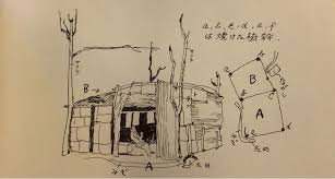
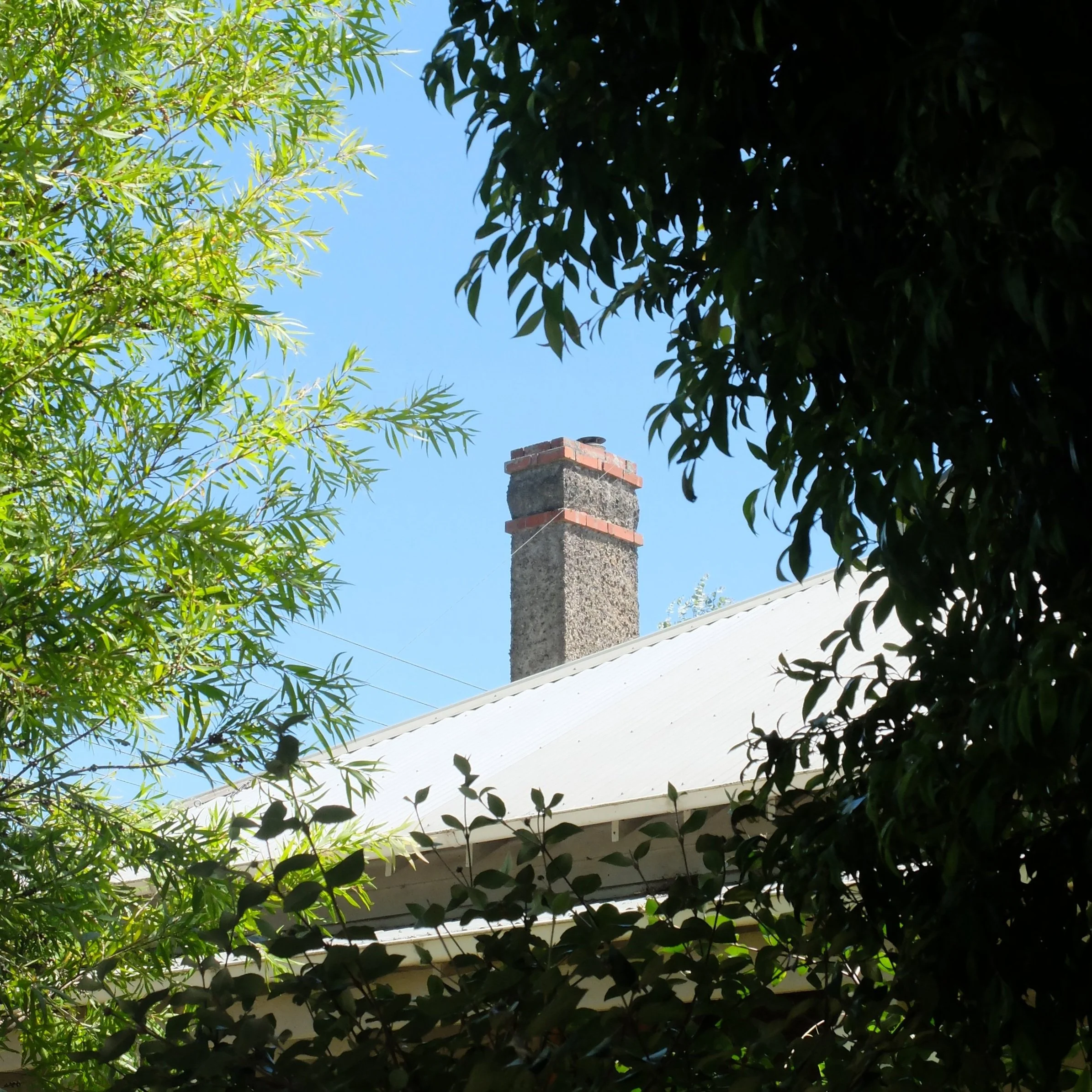
BRICK CHIMNEYS
Traditionally, brick chimneys bricklayers a chance to show off their skills and creativity, without being too showy about it: chimneys are prominent on the building silhouette and visible from the street, but only if you make the effort to look up. Brick chimneys and fireplaces have almost disappeared from new house builds, reflecting the change over the years from coal or wood heating to gas and now split systems. Where new houses have chimneys at all, they are much more likely to be a simple steel pipe with a cowl, connected to a freestanding woodburning stove. But even before this transformation, the Great Scold modernism had stripped the ornament from chimneys as it had from all brickwork, and by the 1960s and 70s most brick chimneys were simple undecorated cuboids.
Who would be a bricklayer today? Nothing but course after course of stretcher bond veneer, with the occasional soldier course over a lintel if you’re lucky. Predictably, modern architects show almost no interest in the endless possibilities presented by the traditional language of brick masonry: bonds, cornices, string courses, arches, colour patterns, ‘special bricks’. Instead there is only stretcher bond, or at the other extreme, attention-seeking gimmicks such as incorporating text into the wall, or Frank Gehry-style ‘parametric’ brickwork- in its way just as mechanical and monotonous as stretcher bond, but somehow supposedly ‘clever’.
Below are a few photos of brick chimneys from the 19th and early 20th centuries, all taken within an area of a few blocks. They range from barely ornamented examples on weatherboard workers’ cottages to more elaborate displays featuring multiple colours and special brick shapes. As is typical of vernacular architecture, they are all more or less the same, and at the same time all different.


MOULDINGS I - AN INTRODUCTION

TRADITIONAL BUILDINGS ARE articulate: composed according to an established grammar of parts and joints to form a coherent, hierarchical whole. One particular characteristic that sets traditional architecture apart from modern, and by which traditional buildings express their articulated nature, is the use of ornamental mouldings: profiles formed in timber, stone or plaster which, when applied according to well-established rules, function to relate the parts of the building to one another through effects of light and shadow.
From the early 20th century, modern architects, committed to the twin ideologies of social and technological progress, began to reject the ornamental tradition. After a century or more of this process of stripping away, buildings are now for the most part inarticulate, in both senses of the word: they don't have a grammar, and they don't have joints.
The art of ornamental moulding is no longer taught in architecture schools, but could easily be revived. There are only a handful of basic moulding profiles, and the rules of thumb governing their use can be found in old textbooks such as this one.
This post will be the first in an irregular series exploring the basic moulding profiles and how they are used, in the hope that it might be of some use to anyone interested in the topic or looking to use mouldings in their own work. Enjoy!

Example illustration from the book ”The Theory of Mouldings” by C. Howard Walker, 1926, linked above.