WHAT HAPPENED TO COLOUR?

Is our era the most monochrome in Australian architectural history? Light gray-dark gray-white, and other equally drab exterior colour schemes, have held sway here for years, and show no signs of going away any time soon.

Most people know by now that ancient Egyptian, Greek, and Roman buildings were a riot of colour:

Egptian columns

Reconstruction of a polychrome Greek temple

As were Gothic cathedrals:

Gothic clustered columns

Even Victorian and Federation vernacular buildings, though their builders had only a limited range of relatively subdued natural (and a few synthetic) pigments to work with, seem positively joyous compared to our desaturated modern streetscapes (but good luck finding a house from those periods that hasn’t been ‘refreshed’ to look ‘contemporary’).

Period Federation colour scheme

Probably a big part of the motive here, for both developers and home owners, is the same as that behind the fact that the vast majority of vehicles are white, silver-grey, or black: the desire for ease of resale. Houses are now painted not to present the individuality and taste of their long-term owner to the street, but to be as bland and inoffensive as possible, with one eye to flipping them for a profit a few years down the track.

This is a great pity, especially in the emphatically not-grey country of Australia, where a short walk in the bush will provide you with endless colour ideas, and where you could spend an entire career working only with the palette found on a single parrot or eucalyptus tree.


A MIX OF COMPATIBLE MATERIALS

Over recent years, the idea has taken hold among architects and planning authorities alike that building facades need to display ‘modulation,’ ‘articulation,’ and ‘a variety of materials and colours’. The state of New South Wales seems particularly intrusive in this, going so far as to promote and even mandate these notions in its planning schemes. The Hornsby Development Control Plan 2013, for example, contains the following provisions for the street facades of medium density housing developments (basically townhouses and the like):

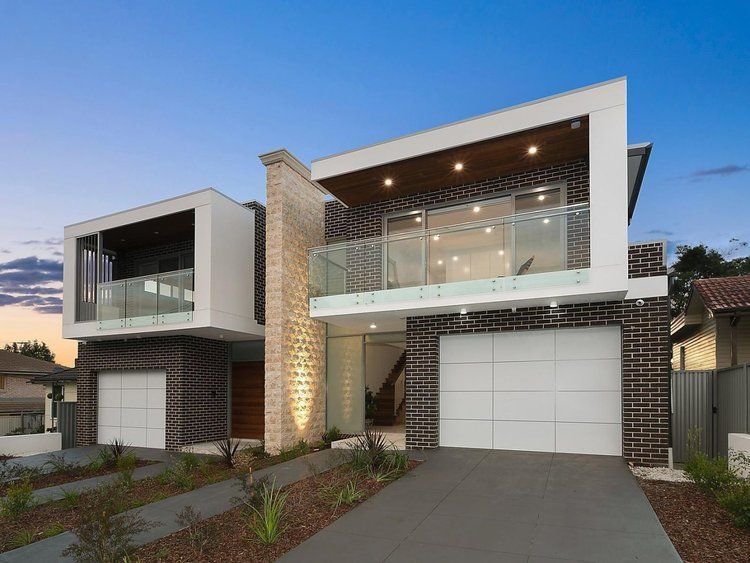
  • Articulation should be achieved by dividing all facades into vertical panels. Wall planes should not exceed 6 metres in length without an offset of at least 1 metre and a corresponding change in roof form.

  • Buildings should include structural elements such as sunshades, balconies and verandahs that provide variety in the built form.

  • Facades should incorporate a mix of compatible materials such as face or rendered brickwork and contrasting areas of light weight cladding.

  • Sunscreens and awnings comprised of timber battens or metal frames are encouraged.

It seems that what is being attempted, albeit in a crude and inchoate way, is the reintroduction of some degree of fractal scaling into the streetscape, although it is highly unlikely that the authors of the planning scheme would have described it in these terms. Rather, town planners probably perceived a need to respond to a creeping featurelessness or blandness of the modern developer-driven ‘builder’s vernacular’ without at the same time going to the other extreme of giving free reign to local architects with pretensions of ‘genius’ along the lines of a Gehry or Hadid. The problem they are faced with, probably insurmountable, is how to reconcile these two aims - the avoidance of ‘monotony’ on the one hand, and the imposition of ‘order’ on the other - within the framework of a modern architectural orthodoxy that regards them as contradictory and antithetical.

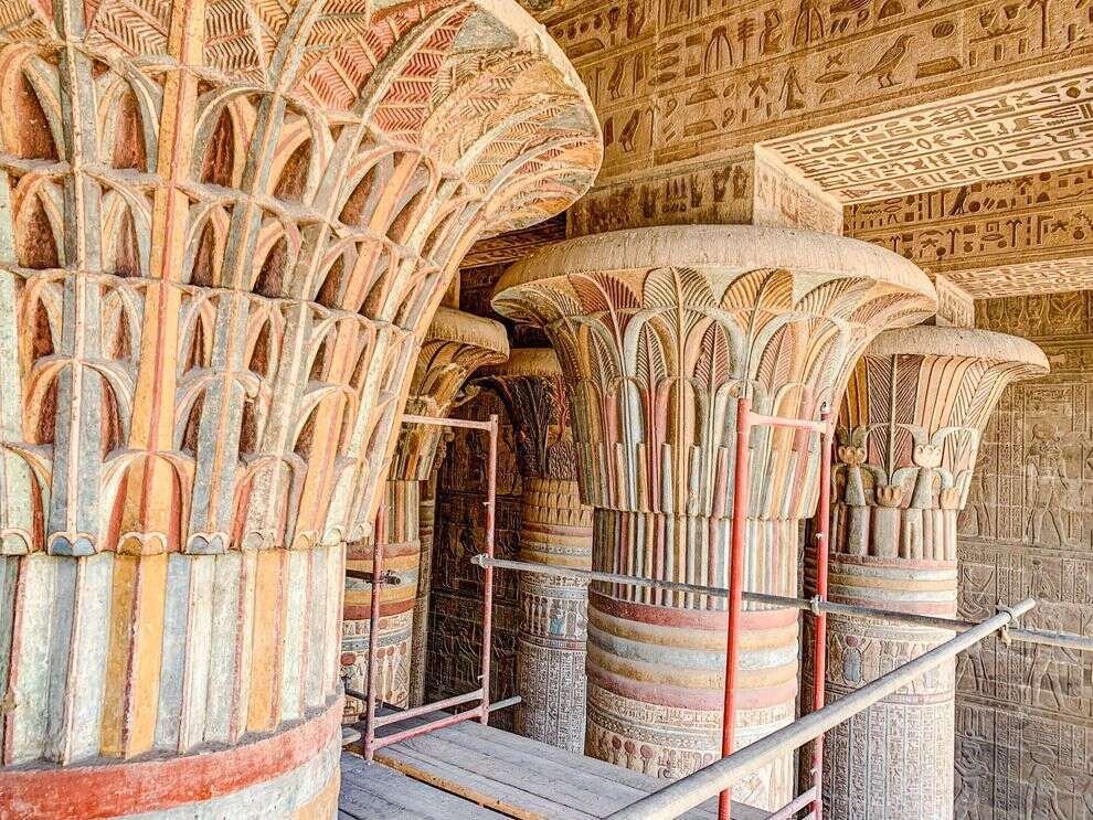
Traditional design, which is essentially self-regulating, had solved the uniformity/monotony - variety/chaos problem before it even arose. Traditionally, streetscapes displayed a stylistic and material uniformity and harmony within each building, and a degree of variety across different buildings, but each still bound by the constraints of traditional design and materials; today, on the other hand, we have chaotic variety within each building, and a kind of monotonous but equally chaotic sameness across buildings.

The traditional architect had no problem with a long, ‘flat’ facade plane completely lacking in ‘offsets,’ because he knew he could easily avoid a monotonous or oppressive appearance by effectively articulating it on both a wider and a finer range of scales than is typically seen today - that is, by the use of pilasters, string courses, cornices, window sashes with small panes set in muntins and deep window reveals in thick walls, a variety of brick bonds, material textures, and so on. Steps in and out in the facade are typically on the order of centimetres, not metres. Today we start with a flat facade, consisting of flat window frames set close to flush in a flat wall surface made up of flat panels of flat industrial metal and flat industrial brick, and grossly overcompensate by insisting that this facade be arbitrarily stepped in and out by metres, and that materials, colours, roof pitches, etc. be varied equally arbitrarily and randomly, with the aim of somehow providing ‘interest’. Predictably, the result this is that every duplex or townhouse development is essentially indistinguishable from any other: dutiful use of ‘a variety of materials and colours,’ thick square or three-sided ‘picture frames’ of alucobond or fibre cement around balcony openings and garage doors, upper levels cantilevered out over brick lower levels, glass balustrades, and random skillions.

A particular modern favourite is to use two or more different brick colours in large ‘panels’ in a facade. Look at any old brick building, in contrast, and you will rarely find more than one brick colour used; where you do, there is a clear dominant or ‘ground’ brick colour, and the other is the ‘figure’ employed to pick out highlights at corners, around windows, and so on. The variety is in the service of expressing a structural or functional differentiation. It was understood that buildings need to project a sense of visual unity.

19th century townhouses in Millers Point, Sydney. With no variety of materials or offsets in the facade plane, presumably this ‘design’ would not be permitted today.

Hotel in The Rocks, Sydney. The facade displays fine-grained ‘offsets’, ornament, and a subtle variety of colours and finishes, differentiated rationally and functionally.


SKILLION ROOFS

A skillion roof or sometimes shed roof is a single-pitch or mono-pitch roof, in contrast to the traditional dual pitch gabled roof, where the two ‘pitches’ slope down symetrically from a central ridge to the longer walls of the building, producing the triangular gables on the shorter walls.

A skillion roof (a) and gable roof (b)

The skillion roof is generally defined as having a pitch (or gradient or fall) of at least 3 degrees or so; roofs shallower than that are usually referred to as flat roofs.

The use of skillion roofs in residential buildings seems to have originated in Australia, with architects such as Robin Boyd employing them as early as the 1950s, but the skillion roof remained largely confined to ‘magazine architecture’ for many years.

Date House by Robin Boyd, 1955

Much of its present popularity, and many of the ‘architectural’ examples of the form from the 1990s on, can be traced to the influence of a single figure: Australia’s defacto architect laureate, Glenn Murcutt, though his influence seems rarely acknowledged (Nemo propheta in patria?)

Murcutt’s skillion roofs are typically clad in corrugated iron, with unlined eaves supported on tapered steel or timber rafters and purlins and sometimes struts, a clerestory of sashless glazing running around the perimeter, and a clear datum separating the clerestory from the walls or glazing below.  The roof runs up to the north (southern hemisphere), the ceiling follows, and the depth of the eaves overhang on that side is carefully designed to exclude summer sun but allow deep penetration of winter light. Shading of the glazing below the datum is accomplished with external adjustable louvres.

Simpson-Lee House by Glenn Murcutt, 1993

But where Murcutt’s skillion roofs - influenced by his love of high modernism, fastidiously detailed, and genuinely functional - bought the form to a higher degree of refinement than earlier examples, the skillion’s later diffusion, first across the architectural world and then ‘down’ into the ‘builder’s vernacular’ to the point that it is now an established element and a common sight in volume-built subdivisions (though it has never come close to supplanting the gabled or hipped roof in popularity), has seen it often reduced to the status of empty stylistic gesture, a lazy, shorthand way of bringing together those shadowy twin concepts of contemporary and sustainable.

Examples at the ‘architectural’ end of the spectrum are often shamelessly plagiarised from Murcutt, but rarely executed with either his aesthetic subtlety or his fine-boned structural clarity. 

This is a winery, not a house, but a good example of what can happen when all you have is “ecologically sustainable outcomes”.

The ‘builder’s vernacular’ skillion has boxed eaves and fascia boards right around the roof: a stumpy, graceless profile.  It may be oriented any which way, and eaves depth is often arbitrary or insufficient.  There might be two or more skillions pitched in different directions on the same building.  There may be no clerestory and the ceiling underneath may be flat.  The skillion here is purely in the service of fashion or style, not function. 

A good example of the dog’s breakfast that is the skillion roof in the ‘builder’s vernacular’.

Though a well-designed and detailed skillion roof can be an effective solution to various environmental or other design considerations, one might still object to the form on a deeper level - call it psychological, or aesthetic, depending on your preference. That is, where the ceiling follows the pitch of the roof, the enclosed space, though dynamic in its asymmetrical upwards ‘loft’, lacks the stillness and serenity desired in a residential space.  The space of the room ‘drains out’ through the clerestory, as opposed to the way it ‘pools’ in the cathedral ceiling, with its obvious metaphors of the inverted hull or cupped hands, or in the flat ceiling, which forms a kind of shoebox lid on the room.  There is something settling about the traditional dual-pitch, symmetrical roof, with each side coming down from a central ridge to ‘cap’ the walls beneath, and in many cases eaves that project out over the walls, protecting them from weather, and if visible from within, serving as a comforting ‘cap-brim’ to the view. 


STEEP AND LOW ROOFS

One of the most characteristic elements of the 19th century Australian worker’s cottage is its roof. Steeply pitched with short spans and therefore low and compact in form, it is perfectly in keeping with the modest volumes it shelters. There are two basic types: either a parallel series of hipped or gabled units, themselves parallel to the street and separated by box gutters; or a U-shaped hipped roof, whose form is not immediately apparent when viewed from the front and sides, but becomes clear when viewed from the back: a box gutter, perpendicular to the street, runs down the middle of the house, separating the two hipped (or occasionally gabled) roofs that form the uprights of the ‘U’.

One explanation given for the emergence of these forms is that the unsophisticated colonial builders had a poor understanding of structural principles: the ceiling joists weren’t tied to the rafters to form a primitive triangulated truss and prevent the rafters from spreading the walls, and so the thrust exerted on the walls by the roof could only be controlled by keeping the span of the roof, and thus its mass, to a minimum. Low roofs with simple rise:run ratios such as 1:1 (45 degrees) or 1:1.3 (a 3-4-5 triangle, 37 degrees) were also easier to construct and required only short rafters.

Aside from these practical and material factors, early builders also no doubt had their aesthetic motivations, and understood very well that low, steep roofs suit these humble cottages perfectly and give them their unique appeal.

On the left: parallel gable roofs separated by a box gutter. On the right: a hipped ‘U’ form roof with an extremely long central box gutter (hidden).

On the left: parallel gable roofs separated by a box gutter. On the right: a hipped ‘U’ form roof with an extremely long central box gutter (hidden).

On the left: a ‘U’ form roof with a lean-to off the back. On the right: a parallel series of three hipped roofs separated by box gutters.

On the left: a ‘U’ form roof with a lean-to off the back. On the right: a parallel series of three hipped roofs separated by box gutters.

A ‘U’ form roof shown from the back, with twin hipped roofs separated by a box gutter

A ‘U’ form roof shown from the back, with twin hipped roofs separated by a box gutter