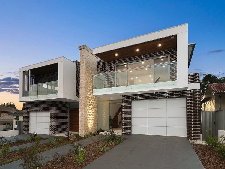
Over recent years, the idea has taken hold among architects and planning authorities alike that building facades need to display ‘modulation,’ ‘articulation,’ and ‘a variety of materials and colours’. The state of New South Wales seems particularly intrusive in this, going so far as to promote and even mandate these notions in its planning schemes. The Hornsby Development Control Plan 2013, for example, contains the following provisions for the street facades of medium density housing developments (basically townhouses and the like):
Articulation should be achieved by dividing all facades into vertical panels. Wall planes should not exceed 6 metres in length without an offset of at least 1 metre and a corresponding change in roof form.
Buildings should include structural elements such as sunshades, balconies and verandahs that provide variety in the built form.
Facades should incorporate a mix of compatible materials such as face or rendered brickwork and contrasting areas of light weight cladding.
Sunscreens and awnings comprised of timber battens or metal frames are encouraged.
It seems that what is being attempted, albeit in a crude and inchoate way, is the reintroduction of some degree of fractal scaling into the streetscape, although it is highly unlikely that the authors of the planning scheme would have described it in these terms. Rather, town planners probably perceived a need to respond to a creeping featurelessness or blandness of the modern developer-driven ‘builder’s vernacular’ without at the same time going to the other extreme of giving free reign to local architects with pretensions of ‘genius’ along the lines of a Gehry or Hadid. The problem they are faced with, probably insurmountable, is how to reconcile these two aims - the avoidance of ‘monotony’ on the one hand, and the imposition of ‘order’ on the other - within the framework of a modern architectural orthodoxy that regards them as contradictory and antithetical.
Traditional design, which is essentially self-regulating, had solved the uniformity/monotony - variety/chaos problem before it even arose. Traditionally, streetscapes displayed a stylistic and material uniformity and harmony within each building, and a degree of variety across different buildings, but each still bound by the constraints of traditional design and materials; today, on the other hand, we have chaotic variety within each building, and a kind of monotonous but equally chaotic sameness across buildings.
The traditional architect had no problem with a long, ‘flat’ facade plane completely lacking in ‘offsets,’ because he knew he could easily avoid a monotonous or oppressive appearance by effectively articulating it on both a wider and a finer range of scales than is typically seen today - that is, by the use of pilasters, string courses, cornices, window sashes with small panes set in muntins and deep window reveals in thick walls, a variety of brick bonds, material textures, and so on. Steps in and out in the facade are typically on the order of centimetres, not metres. Today we start with a flat facade, consisting of flat window frames set close to flush in a flat wall surface made up of flat panels of flat industrial metal and flat industrial brick, and grossly overcompensate by insisting that this facade be arbitrarily stepped in and out by metres, and that materials, colours, roof pitches, etc. be varied equally arbitrarily and randomly, with the aim of somehow providing ‘interest’. Predictably, the result this is that every duplex or townhouse development is essentially indistinguishable from any other: dutiful use of ‘a variety of materials and colours,’ thick square or three-sided ‘picture frames’ of alucobond or fibre cement around balcony openings and garage doors, upper levels cantilevered out over brick lower levels, glass balustrades, and random skillions.


