VERNACULAR PICTURES 10: ARCHITECTURE ON SCREEN

Do an image search for ‘architecture in movies’ and the results you get back are a largely predictable survey of what most people (and probably most architects) would think of when prompted by the term: sci-fi cityscapes and mega-sets going right back to Metropolis (1927), or some species of ‘high architecture’, typically brutalism or clinical modernism. Utopias and dystopias.

Finding good traditional and vernacular architecture and design on screen, on the other hand, is not something you can do with a simple google search. It’s more of an incidental treasure hunt: occasionally coming across an interesting facade or design detail in something you happen to be watching for unrelated reasons. Unsurprisingly, these finds tend to come not from sci-fi films or big budget spectaculars, but from historical movies and documentaries. I have a small collection of screenshots of buildings from such sources, with nothing in common other than that something about them caught my eye. Unfortunately I saved many of them with titles like ‘dfwfkigwhx’ so don’t always remember where they came from!

From an unknown film.

From Robert Eggers’ The Witch (2015).

From an unknown documentary.

From an unknown documentary.

This painterly scene from one of Sergio Leone’s The Man With no Name trilogy of films (I forget which- probably The Good, the Bad, and the Ugly) is a clear homage to Vermeer’s The Milkmaid.

Johannes Vermeer’s The Milkmaid

Architecture on screen can either be real buildings, or buildings that are built as ‘props’ for a film or television production and so are generally not fully functional. There is also the category of buildings in historical parks, which might be genuine historical buildings relocated from elsewhere, or modern but faithful and complete reconstructions. There is an overlap here: historical theme parks are sometimes used to film movies or television programs, and historical movie sets are sometimes opened to the public, for example the set of ancient Rome built for the TV series Rome at Cinecitta Studios, also in Rome. Toei Movie Village in Kyoto, Japan was intended from its inception to operate both as a movie set and theme park, often at the same time.

Set of the TV series Rome

Toei ‘Movie Village’ in Kyoto, Japan.

Part of the appeal of what you might call ‘set’ architecture is that it presents us with buildings that no longer exist in the world, either because they would be illegal to build, or because there is simply no demand for them. Unencumbered by codes, regulations, or popular taste, vernacular architecture on screen is ironically more ‘authentic’ and beautiful than anything you will find in real life in many places. Perhaps ‘Go into the movies’ is good advice not just for young actors!


TRADITIONAL DESIGN IV - PUSHING AND PULLING PART 2

Following on from last week’s post on Salingaros’ ‘push-pull’ model of generating fractal structures in architecture, here we will consider the implications of this conceptual framework on architectural design, particularly with regards to horizontality and verticality.

As discussed, the model combines the two axial forces, tension and compression, with two orientations: vertical and horizontal. Creating a matrix of these forces and elements would suggest a total of four possible combinations; however, Salingaros only considers three of these combinations valid in the context of architectural design: horizontal tension, which creates vertical perforations; horizontal compression, which creates vertical folds; and vertical compression, which creates horizontal folds or bulges. That vertical tension has been omitted is not an arbitrary decision or an accidental oversight: it is because, in Salingaros’ view, vertical tension expresses an unstable and unnatural ‘anti-gravity’ state; there is no natural force or mechanism that can act on a building to produce vertical tensile stress. In other words, there are biological and biophilic constraints on the push-pull model: we are an upright animal, and our physiology orients us vertically (all vertical really means is ‘along the line that gravity acts’), perpendicular to the horizon. We evolved under the force of gravity, and we possess an internal model of it, an ‘instinct’ that tells us that a vertical pull is somehow ‘off’ or ‘wrong’.

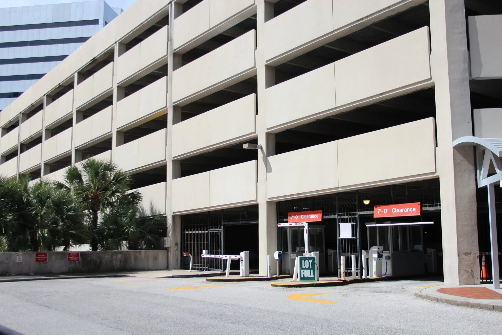
It follows from this that the horizontal perforations (such as horizontal windows) resulting from vertical tension are also unnatural, and produce anxiety in the observer. Vertical tension breaks the facade of a building, cutting and separating it into horizontal windows, spandrels, and slabs. Salingaros references the philosopher Roger Scruton’s observation that most modern buildings are just stacked horizontal slabs, with the archetypal example being the multi-storey parking garage.

Both the parking garage in the foreground, and the office building in the background, display the anxiety-inducing horizontal perforations that result from the ‘vertical pull’ model of designing a building.

It is something to ponder that of the four possible combinations of axial force and orientation, it is the one that is most antithetical to nature, the most anxiety-inducing, that has become dominant and ubiquitous in architecture today. The esteemed modernist architect Le Corbusier was instrumental in this development; in particular his Dom-ino House (1914-15), which formed the conceptual basis of his output over the following decade, has proved to be immensely influential on subsequent approaches to architectural design.

Le Corbusier’s Dom-ino House

Lifting the ground plan upwards to create the building, in a kind of copy-paste process, destroys the possibility of three-dimensional design. The ‘vertically stretched’ building, with its facade of horizontal elements, is in effect a two-dimensional object, and cannot be related to by humans in any natural way; it is not really designed but rather pulled into existence, in a process akin to unpacking a Chinese lantern.

Chinese accordion lantern

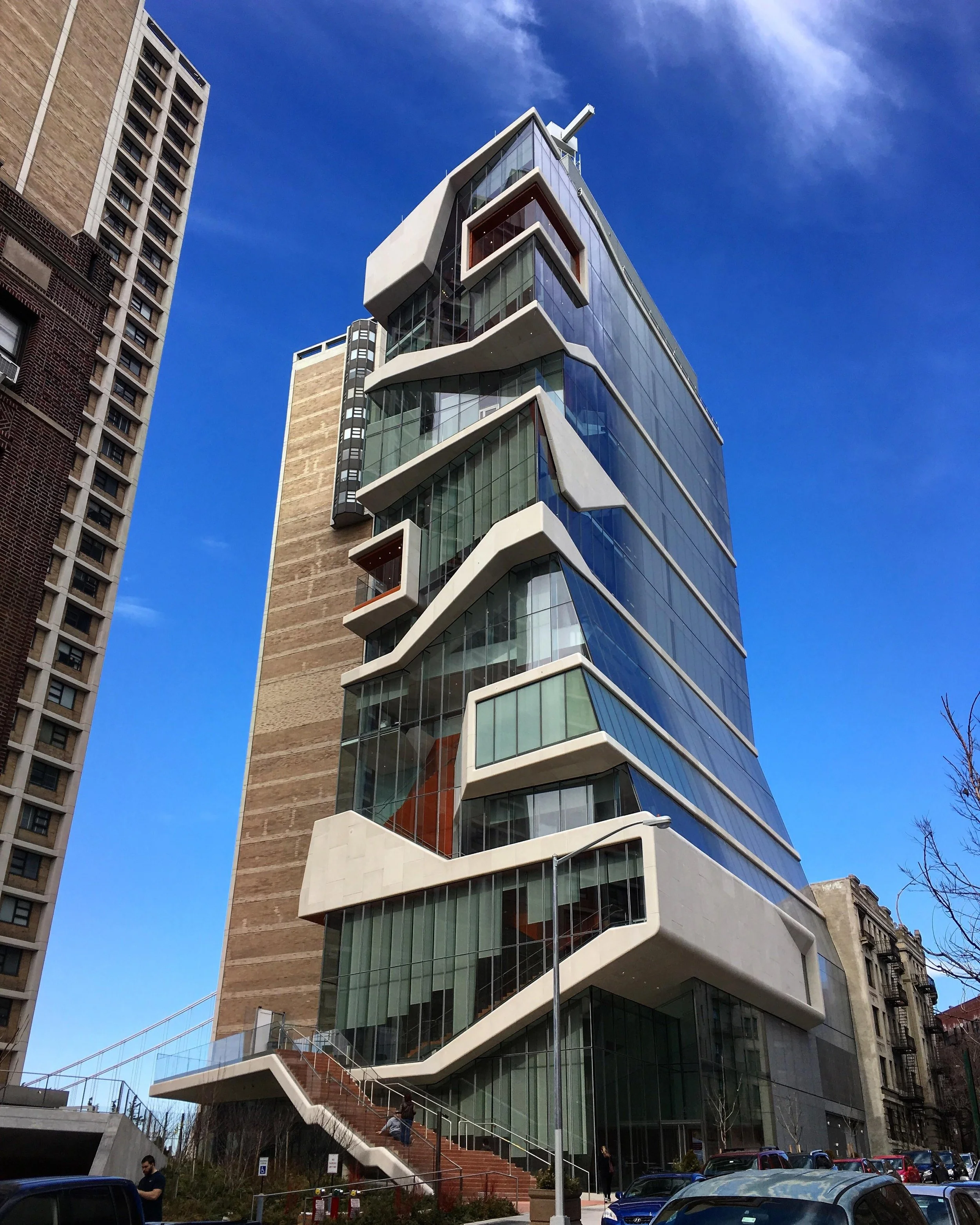
It is telling that even buildings designed according to the contemporary ‘parametric’ methodology, while no doubt considered sculptural by their designers, cannot escape this ‘Chinese lantern’ quality, or the sense of being fundamentally horizontal and two-dimensional.

A generic example of a contemporary building that, for all its heavy-handed cleverness, is still just a stack of horizontal slabs.

The superficial facade treatment cannot disguise the fundamental two-dimensionality of the building.

The designers of the earliest skyscrapers, in contrast, by working within a traditional design paradigm, were able to produce buildings of genuine three-dimensional, sculptural quality, with a dominant sense of verticality to their facades.

Example of an early ‘skyscraper’ displaying a strong sense of verticality.

The massing of the overall form, articulation of the facade, and window proportions of this early skyscraper combine to give it a strongly vertical character.

An intriguing ‘hybrid’ or ‘transitional’ example: the overall form is convincingly three-dimensional and suggestive of the vertical, but the proportions and repetition of the windows allow the horizontal to dominate, resulting in a somewhat dissonant and unsettling overall effect.

Vertical tension can even seem to pull the building right off the ground, the connection only maintained by minimal supports called pilotis, which, within the framework of the push-pull model, are not true columns but slim members that seem to by trying to efface their own supporting role and make it appear that the building is floating above the earth, away from the human realm. The piloti is in a sense the opposite of the column: whereas columns are compressed cylinders; thickened at capital and base and fully expressive of their role in supporting the building under gravitational load, pilotis are stretched cylinders, seemingly narrowed by a vertical pull.

The novelty ‘floating’ and ‘cantilever’ effects made possible by the piloti have been much sought after by architects and lauded by critics, but in Salingaros’ view this is a perverse and artificial attitude that one must actively work to convince oneself of, via long immersion in Critical Theory and academic propaganda.

Le Corbusier’s Villa Savoye, perhaps the archetypal example of the use of pilotis in modern architecture.


TRADITIONAL DESIGN III - PUSHING AND PULLING PART 1

This is the third in a series of posts exploring the ideas of the mathematician and design theorist Nikos Salingaros, and by extension those of his collaborator, the architect Christopher Alexander.

The first and second posts in this series covered Nikos Salingaros’ theories on fractals and fractal scaling in architecture. Here we will build on this foundation by looking at Salingaros’ exploration of how fractal structures are generated, via his analogical ‘physical’ model.

The basic model Salingaros proposes is the ‘push-pull’ model, which incorporates the two axial forces of tension (pulling) and compression (pushing), and their respective effects, perforation and folding, to account for how various architectural (and fractal) elements are generated in architecture. The role of bending forces and processes, in generating ‘boundaries for space’ such as curves and domes, is touched upon but not in great detail, so will not be covered here. Nor does Salingaros consider shear in relation to architecture, and it would be interesting to explore the possibilities of incorporating this force into his models.

Perforation, like the theoretical example seen in the Sierpinski gasket discussed in the previous post in this series, is the process of generating openings in a surface. In architecture, perforation results in windows, doors and other openings. Perforated elements have the property of semi-permeability; they let some elements through and prevent others from passing. Salingaros gives the example of the bollard, which permits pedestrians but blocks cars.

Perforations are generated by tension. Imagine a strip of rubber coated with sealing wax. If you pull on both ends of the rubber strip (i.e. apply tension), the wax will crack at regular intervals along the length of the strip - first into larger pieces, then each larger piece into smaller and smaller pieces. Note here that these cracks or ‘perforations’ are oriented perpendicularly to the axis of the tensile force - the importance of this point will become apparent in the next post in this series. Applying this analogy to architecture, we see that if we metaphorically ‘pull’ a wall horizontally, it will perforate into vertical openings - firstly windows and doors, and then, if we keep pulling, the wall will further separate out into arcades, then columns.

Diagram by Nikos Salingaros illustrating the process by which increasing horizontal tension creates first windows, then arcades, then columns.

Folding, by contrast, is the process of generating elements like folds, meanders, thickenings, hollows, and bulges by applying compression. Whereas perforation removes material from a plane, to fold is to fill space: ‘folding the line is the first step to filling the space slightly’. Architecturally, folding finds expression in articulating elements like pilasters on a wall, the capital, base, and fluting of a column, and thick door and window frames. Salingaros also gives the example of alcoves in a temple wall.

An alcove in a wall, flanked by pilasters.

Again, note for later that compression creates folds that are oriented perpendicularly to the axis of compression, so horizontal compression creates vertical fold lines, and vertical compression creates horizontal elements, like the ‘bulging’ of a classical column at its head and base.

Diagram by Nikos Salingaros illustrating the process by which increasing horizontal compression creates folds in a plane at successively smaller intervals and scales.

Classical columns embody the effect of vertical compression: bulges at the head and base, and entasis of the shaft.

From a structural perspective, folds create strength or stiffness in a material by moving parts of it away from its central axis; this is why steel sheeting is corrugated. Salingaros points out that a floor with beams exposed on its underside is visually expressive of the same idea: the beams can be regarded as the locations of strengthening ‘folds’ in the plane of the floor.

From a structural perspective, the beams in the floor plane are equivalent to the corrugations in a sheet of corrugated iron.

In the next post, I will consider the implications of Salingaros’ push-pull model on approaches to architectural design, in particular in explaining the traditional emphasis on verticality over horizontality in architecture, which, as Salingaros demonstrates, is not merely a superficial stylistic preference, but has an objective basis in physics and evolutionary biology.


JAPAN PHOTOS 1: WOODEN LOCK

Still in January (summer) mode here, so for the next few weeks I am just going to be lazy and post photographs I took in Japan, until the weather cools down or inspiration strikes again.

This one is of a simple but clever timber locking mechanism to a sliding door in a minka dwelling. It is shown here in a ‘half-cocked’ state. To lock the door, you push upwards from below on the vertical ‘bolt’, the upper end of which (out of shot) then goes into a mortise or ‘bolt-hole’ cut into the head of the door opening. The short horizontal member or ‘key’ is then slid across to the right to lock the vertical member in place. To unlock, you simply slide the key back to the left, and the bolt drops back down onto the stile.


VERNACULAR PICTURES 9: HALF DOORS

One type of building envelope filter with great aesthetic appeal is the ‘half door’ or ‘Dutch door’: an external hinged door with independently openable upper and lower halves. The two halves may be completely separate leaves, with each leaf hinged directly to the door jamb; or the upper leaf may be a ‘door within a door’ hinged to the stile of the main door, a type most common in Ireland.

In terms of its filtering functions, the half door can work either as a normal door, or, when the top half is left open, as a gate, allowing light and air to pass while keeping farmyard animals from entering the house, keeping children from wandering outside, and preventing dust and debris from blowing in. The half door also acts as a social filter at the threshold of public and private: it allows comfortable, direct social exchange with a degree of separation, be it with salesmen or other strangers, or even with friends, when the visit is of the ‘I won’t come in…’ variety. In this role it is analogous to the Japanese genkan, where the social ‘gate’ is the change in floor level.

Half doors were never common in Australia, perhaps because the screen door performs much the same function, with the added (and absolutely essential in rural areas) role of keeping out flies.


KOUSHI AND FACADE ARTICULATION

An addendum of sorts to the previous post on koushi:

An important characteristic of the machiya facade is the subtle stepping-back in depth or ‘reveals’ (mikomi, 見込み) of the various members: posts to sills, posts to plaster infill, koushi perimeter frame to horizontals, horizontals to verticals, etc.  These reveals are only on the order of 10-20mm or so, but they impart subtle variety and visual interest to the facade, giving it depth, shadow, and life.  The rhythm of the facade is played not only along the x or left-right axis, but also along the z or front-back axis. This has its analogue in traditional Western brick facades, which achieved similar effects by stepping courses and rows of brick in and out to form cornices, string courses, pilasters and the like- again, variations of only a few centimetres are enough to bring the facade to life. This is in contrast to the modern industrial predilection for ‘flush’ surfaces, and the resulting over-compensation of planning schemes in demanding exagerrated setbacks in the facade on the order of metres, as I have written about in an earlier post. 

The stepping-back also appeals to structural logic: primary members are foremost, with subsequent members set back according to structural importance. 

Finally, mikomi gives thought to the carpenter or joiner.  If all members are designed flush, there is no tolerance: any error is glaring.  But if, for example, a beam or header rail is tenoned into a post with a designed mikomi of 10mm, an error of a millimetre or two either way will be unnoticeable. 

VERNACULAR PICTURES 8: KOUSHI

Continuing on somewhat from last week’s post on the filtering functions of the building envelope, here I would like to consider the Japanese koushi: the timber lattice covering the (usually front) windows of Japanese townhouses.

View of the street through the koushi from within the entrance of a townhouse.

View of a koushi-covered facade at night.

The koushi is a great example of the ‘subspecies’ that arise within any element or ‘species’ of vernacular architecture, evolving over time via a process of functional and regional differentiation. The generic koushi has several basic functions: to provide security against forced entry, and to grant the inhabitants some privacy from prying eyes (although privacy was not really a concept in pre-modern Japan, nor one for which the Japanese language even had a word: today they use the English transliteration puraibashii). Aesthetically, koushi provide a sense of verticality to windows that are generally in a ‘landscape’ orientation, and adds rhythm and fractal detail to an otherwise fairly unornamented facade.

A fine koushi showing one of many patterns of cutting the ‘slats’ short at the top to admit more light without compromising on privacy.

Koushi consisting of alternating stout, full-length members with shourter, finer members.

Machiya townhouses containing valuable commodities like alcohol (sake) had the stoutest koushi, called sakaya ‘sake shop’ koushi. Likewise, rice shops (komeya) had komeya koushi, with thick, roughly dressed members that could withstand impacts from wayward barrels of rice and shrug off any scratches and dents. Charcoal shops (sumiya) had sumiya koushi, with very wide, closely-spaced slats, to prevent breezes and drafts from stirring up carbon dust inside the shop. Silk-weaving premises (itoya) and other industries involved in precision craftwork had thin, widely-spaced itoya koushi, to allow in as much light as possible.

Examples of some of the most common types of koushi. From left to right: itoya koushi, sumiya koushi, sakaya koushi, and komeya koushi.

Koushi have become something of a lazy cliche or trope in modern architecture, both in Japan and the West. A common modern abuse or misuse of koushi is to use them in front of blank walls, or to partially obscure things which would be better off completely hidden.  Traditional koushi draw the eye and entice the attention because they are always in front of something worth looking at, i.e. a garden (possibly welcome attention), or a front room (probably unwelcome).  Modern ‘decorative’ koushi on blank walls would have baffled carpenters of old. 

A modern Japanese example of koushi: frameless; consisting only vertical elements all identical in length, dimension, and setback; and arbitrarily covering both windows and blank wall.

Modern or modernist koushi are also almost always without a perimeter frame and lacking any of the subtlety imparted by varying the length, dimensions, or setback of the vertical members.  There are aesthetic (“It looks more sleek and modern!”) and no doubt economic motivations for this simplified form, and it can be effective, but rarely. 


BUILDING ENVELOPES AS FILTERS

The envelope of a building can be thought of as an assembly of filters, with each filter allowing, and preventing, a particular set of elements from passing through it. These elements might include heat, cold, light, radiation, water, moisture, rain, snow, air, drafts, breezes, fire, embers, smoke, views, sound, noise, strangers, children, burglars, pets, farm animals, insects, smells, dust, pathogens, toxins, vehicles, or projectiles. The strongest filter is a thick concrete bunker wall; the weakest is a large opening without door or glazing.

Many of the filters in buildings are operable or ‘tuneable’ to some extent, the most obvious examples being doors and windows. In most Australian houses, the conventional filter arrangement for windows is an openable, clear-glazed sash, with a flyscreen which may be fixed or openable/removeable. Flyscreens are considered essential to keep flies out in summer, and mosquitoes out at night - in other, malarial places, the ‘insect filter’ might be brought within the envelope, in the form of a mosquito net over the bed.

So the conventional filtering options for a window are: with sash closed, admitting light and view but excluding air, smells and most sound; with sash open, admitting light, view, air, sound and smells. Adding some combination of blackout curtain, lace curtain, and/or blinds gives you additional control over light and views.

There are other, less conventional ways of arranging the filtering functions of a window: you might have two-part windows, for example, with one part fixed glazing and the other part an insect-meshed opening fitted with an operable shutter. The advantage of this arrangement is that it avoids the expense and complexity of a modern operable glazed sash, and can be constructed DIY without too much skill or trouble.

Glass is something of an illusory material in that it gives the impression of openness, but in fact a closed window, while it admits light and view, filters out a great deal else, and largely excludes the exterior from the interior in the sensory sense. A house with an envelope consisting almost entirely of floor-to-ceiling fixed glazing is much less in contact with the outside environment than a house which is all solid wall other than for a single unglazed opening.  This isn’t necessarily a bad thing: in unpleasant environments, the ability of glass to divide light and view off from the other senses is often desirable, and one we take for granted.

In contrast, the semi-opaque paper-covered shoji of traditional Japanese dwellings admit light and sound but not view, and their solid timber amado shutters prevent sound to a degree, but exclude light. You cannot have light without sound, and you cannot have vision (view) without the other senses: smell and touch (breezes) and, in winter, cold. Again, the filter is brought within the building envelope, in this case in the form of warm clothes.


VERNACULAR PICTURES 7: EARLY AUSTRALIAN VERNACULAR

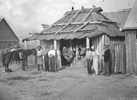
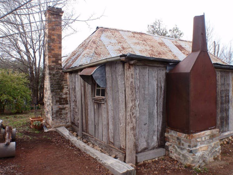
The early cottages and huts of Australia’s pioneers and settlers have great charm and appeal. Their primitive, at-hand materials - bark and log or corrugated iron roofs, timber slab walls sometimes rendered in clay or lime, and the characteristic ‘standoff’ chimneys, with flues also often constructed in timber and bark - soon gave way to more refined options once they became available, but the basic form - small, rectangular and compact, a central entrance and hall with a room on either side, steep gabled or hipped roofs - survived into the 20th century in both rural and urban contexts, as the workers cottages and miners cottages so popular in inner suburbs today.


VERNACULAR PICTURES 6: TENSILE STRUCTURES

Tensile structures are extremely rare in traditional architecture, because the most common traditional materials of that architecture - stone, brick, and mud - have almost no tensile strength. Timber is the exception, but even timber is relatively weak in tension, and has traditionally been used either under pure compression (posts and columns) or under bending (beams, lintels, joists, and rafters), where the tensile strength is a component of bending strength. Timber trusses, which contain members in pure tension, are a relatively recent invention, and rely on quality metal fixings at the nodes. Large-scale tensile structures didn’t become feasible in architecture until the appearance of quality steel, in the form of truss members and cables.

Traditional and even contemporary buildings are almost all compressive, and all extant ancient buildings are too, because only compressive structures endure. The pyramids of Egypt are the standout example, and owe their extreme longevity to the maximal stability of their form- a pyramid is really just an organised pile of rocks, tapering from base to apex, at or near the angle of repose.

In contrast to the inherent stability of compression structures, tensile structures are inherently unstable; or rather they have a dynamic stability, which is part of their aesthetic appeal. They are less suited to fixed buildings than they are to portable or ‘velocity’ structures where lightness is important- think sailboats, early aeroplanes, bows, and bicycles.

There is one traditional architectural tensile structure, however, that shares the same attributes as these non-architectural tensile structures: the tent. Indeed, tension and tent (and many other English words like tendon and tendril) come to us from the same root: the proto-Indo-European ten-, meaning ‘to stretch’. Tents make use of the few ‘contrary’ traditional building materials that excel in tension but have no compressive strength - fabric, hide, cord, and rope - in combination with economical use of compression elements such as poles.

Perhaps because of their ephemeral nature, tents get far less attention in the architectural world than the more solid and long-lasting building typologies constructed in stone or brick or even timber. Probably the best-known vernacular tent type is the ‘black tent’, whose traditional distribution stretches from North Africa to Central Asia; tents of this type are still in common use by the nomadic groups of these areas. The more famous Mongolian ger and Central Asian yurt are arguably not true tents, at least not in the structural sense, since the ‘skin’ is just a veneer hung over timber lattice walls and a timber rafter roof.

Black tents are perfectly suited to the hot, dry, windy desert climates in which they are found. Black may seem an ill-advised choice of colour, but it gives the fabric greater longevity against UV radiation, and also serves to create a vertical temperature differential in the tent, drawing air through it from the bottom to the ridge. The density of the fabric weave means that under normal conditions, air (but not sand) can pass through the fabric itself; on the rare occasion that it rains, the threads swell up to become more watertight. The walls of the tent can be opened or closed depending on the conditions, and the low-slung form allows the tent to stand against ferocious wind and sand storms.

The traditional method of repairing the fabric of the black tent is somewhat poetic and almost biological: when the strips of fabric closest to the ground are frayed beyond repair by wind and sand, they are removed, but not directly replaced; instead, the two sides of the tent are unstitched at the ridge, the two new strips are inserted there, and the two sides are stitched back together, so that each strip, newer than the strip below it, moves down one position in the wall, until it eventually reaches the bottom and is removed in its turn.


VERNACULAR PICTURES 5: SPOLIA

Spolia (from the Latin ‘spoils’) is the name given by architectural historians to (typically stone) fragments of earlier buildings that have been repurposed to serve as part of later buildings.

In the west, spolia are probably most closely associated with the period spanning the late Roman empire and the early middle ages- a period of decline in resource availability and technical ability, in which scavenging older or derelict buildings for building materials was common.

The practice is a good illustration of the writer John Michael Greer’s theory of ‘catabolic collapse,’ which uses the analogy of biological metabolism to explain the life-cycles of human civilisations. When civilisations are on the rise, they grow in an ‘anabolic’ manner, whereby ‘cheap and easy’ energy is consumed to combine simple elements into more and more complex structures, just as the human body transforms dietary proteins and energy into muscle. When energy is no longer cheaply or easily available, civilisations enter their decline and collapse phase, and their complex structures are broken down via ‘catabolic’ processes into simpler elements in order to unlock the energy and resources they contain, just as a starving organism will cannibalise its own muscle to meet its energy requirements. Think of the energy inputs, technical expertise and apparatus needed to produce and distribute even something so seemingly simple as dimension lumber, and then to assemble it into the form of a house; compare this with the act of pulling the house down and burning its timber to stay warm.


VERNACULAR PICTURES 4: PAINT AS ORNAMENT

One objection that is sometimes raised against the possibility of resurrecting ornament in modern architecture is the expense of it, whether real or perceived. However, the residential vernacular architecture of the world presents us with many examples of one possible solution: using paint to ornament or decorate buildings that are otherwise plain (i.e. lacking in fractal scales). A few examples are presented below.

The counter-objection against introducing this practice into our own building is that, just as we no longer have a genuine vernacular architecture, we also no longer have a shared vocabulary of unconscious, communal folk images or motifs to draw from; indeed, we no longer have a folk culture at all.

We do however have a precedent for what widespread ‘exterior decoration’ would probably look like in the modern context: the mainstreaming of tattoos. Instead of the ‘variety within uniformity’ and symbolic/ritual significance of say traditional Polynesian or Ainu tattoos, or even of underworld or sailors’ tattoos, tattoos in our own society are simple self-expression; everyone is free to pick and choose designs and styles from every era and every area of the world, or to make up something ‘unique’ according to their own imaginative whims. Imagine the architectural equivalent of this: houses with LIVE LAUGH LOVE and other inspirational slogans written in big bold letters across their facades.

But there is still a lot of potential in the idea of painted ornament in a modern setting, and there’s no reason it shouldn’t be one of the architect’s tools of the trade, to be at least considered if the circumstances suggest it and the conditions are right.


VERNACULAR PICTURES 3: LOG AND PLANK CONSTRUCTION

I’ve never been a fan of log cabins, at least not the sort most people associate with the name, where large diameter logs are left ‘in the round’ and stacked up by notching them out near their ends and interlocking them in alternating rows at the corners:

To me the effect is both crude and kitsch at the same time. But when the logs are squared off, or dressed into planks, and especially so when the gaps are plastered, ‘log’ cabins become a different thing entirely- they have the right balance of rusticity and sophistication, and you can easily imagine them being integrated into a ‘modern’ design very effectively.


VERNACULAR PICTURES 2: STEPPED GABLES

Stepped gables, or crowstep gables, are a form of gable wall where the parapet (the part of the wall that extends above the roofline) is stepped down from ridge to eaves, resulting in a number of horizontal sections. When the gable end of a building forms the building’s facade, stepped gables give a pleasing rhythmic quality to its appearance. Apart from this aesthetic consideration, stepping the gable removes the need for cutting bricks or stones to the angle of the roof, and the stepped parapet also serves as literal steps, allowing chimneysweeps or roofers to gain easy access to the ridge. It is this function that offers a clue as to why stepped gables are characteristic of Northern European architecture - the colder climate means more rain and snow, which necessitates steeper roofs, which in turn means more difficult access. Stepped gables are also a common feature of traditional Chinese architecture, though typically with a much smaller number of sections, and with the gable wall forming the side rather than the facade of the building.

A streetscape of stepped gables in Belgium.

Belgium again.

A relatively stark example, lightened by the patterned storm shutters, richly ornamented oriel window, and scupture of a stag on the ridge.

Culross Palace, Scotland.

Three-part stepped gables on the sides of Chinese vernaluar buildings.

Another example of a Chinese stepped gable (here dividing the roof rather than ending it, so perhaps more accurately called a party wall or fire wall).

An interesting example of a European stepped gable which shares features of the Chinese variety: the steps of the gable are themselves pitched, and roofed with the same material (in this case slate?) as the main roof.


VERNACULAR TYPOLOGIES 1: THE OAST HOUSE

Building typology refers to the classification of buildings into types according to similarities in form or function. The building types that most often come to mind, and that typically receive the most scholarly attention, are the ‘high’, classical or formal building types: the temple, cathedral, castle, school; and later, with the coming of the industrial revolution, the railway station, factory, airport, and the like. But some of the most appealing and fascinating building types are vernacular: buildings whose form reflects a very specific function, a function which in turn is the result of a very specific set of local conditions relating to culture, climate, agriculture and the like.

One of my favourite vernacular building types is the English oast or oast house, a building consisting of two parts: a rectilinear one- or two-storey volume (the ‘stowage’) for the storage of freshly harvested hops, and an attached tower (usually round with a steep conical roof) for the drying of the green hops over a fire at the base of the tower. Obviously, oasts were only found in areas where the climate was suitable for large-scale hops production; they are most closely associated with the counties of South East England, Kent in particular.

Today we might think these buildings look somehow ‘contemporary’ or ‘cool’, but that is to see them with a tainted eye. Their builders were innocent of such modern concepts, though no doubt they and the people who lived around these structures appreciated their effortless utilitarian beauty.


BUILDINGS WITH FACES

There is an idea sometimes encountered in modern architectural teaching and theory that it is somehow inauthentic or ‘fake’ to put more design effort, expense or ‘weight’ into the facade of a building than into the other sides; indeed, that a building shouldn’t even have a recognisably dominant side, but should rather be regarded and designed as a sculpture whose full profundity can only be grasped by a 360 degree walkaround. The paradigmatic example would be a building like Le Corbusier’s Ronchamp Chapel.

Ronchamp Chapel by Le Corbusier

Traditional buildings in such parklike settings, in contrast, whether cathedrals or country mansions, were always designed with a recognisable front. It was considered self-evident that buildings should have ‘faces’ just as people do, where expression and character are concentrated.

Villa Foscari by Palladio

At any rate, sites that allow buildings to sit visually unencumbered by any neighbouring structures have always been relatively rare, and are almost nonexistant in urban residential neighbourhoods. There is nothing inauthentic about putting more design time and money into a street facade, for example by using more expensive timber-framed windows only in the facade, and cheaper aluminium framed windows elsewhere. In fact, the classing of bricks into ‘common’ or ‘face’ varieties arose from this practice of favouring the front: the finest, most uniform and blemish-free bricks were graded ‘face’ quality, for use in the facade, and the rest ‘common,’ to be used on the back and sides of the building. Though the terms face and common brick survive to this day, the consistency of modern brick manufacturing has made the distinction almost meaningless, and the colour variation and visual interest displayed by ‘common’ brick is ironically often regarded as equally if not more attractive than the perfection and uniformity of ‘face’ brick, and used over the entire house.

The desire to give a building a pretty face should not be understood merely as an aesthetic custom or preference. It also has deeper social importance- it is a gesture to the street, and by extension symbolic of a willingness to engage with the public realm and the community.


TECHNOLOGY AND TRADITION

The period from the beginning of the industrial revolution through to the early 20th century is fascinating for the way in which architects and engineers were able to successfully adopt novel building methods, typologies, technologies, and above all materials - cast and wrought iron and later steel, Portland cement and reinforced concrete, and large panes of glass - into their buildings. But because they integrated these elements seamlessly into the unbroken lineage of traditional and even classical design idioms, rather than employ them in ‘radical’ ‘innovative’ and ‘challenging’ design ‘approaches’ as would be expected today, this long, fecund period has been somewhat memory-holed. Though it fits well into the history of building technology, in ideological terms it is on the wrong side of ‘year zero’ (whenever you define that to be) and it sits uneasily with the dominant contemporary narrative - that the current moment is somehow ordained; that the Modern is superior to the traditional and even represents a kind of ascent to a higher plane; that the break with and ‘leaving behind’ of the traditional was somehow inevitable and even morally necessary; that technological progress must necessarily go hand-in-hand with Progress as ideology, Progress in Theory and Progress in aesthetics; and that progress in such things is even possible.

Rather than be disheartened by the decoupling of material technology from traditional design, however, we should instead view the achievements of this period as a cause for optimism- after all, if it was done once, why shouldn’t it be done again?


VERNACULAR PICTURES 1: LOW CEILINGS

A big workload over the past week (and probably for the next month or so) hasn’t left me any time to write a proper post this week, but instead of breaking the streak I’m going to cheat for a while, and do a series of low-effort posts based around images and featuring some of my favourite themes, elements and designs.

To kick things off: low ceilings in vernacular architecture. Lowering the ceiling is not just a way of saving on construction materials and ongoing heating costs; it is also very effective in giving a space a sense ‘cosiness’ or intimacy, especially when a low ceiling is used within, and to give contrast to, a larger space with a higher ceiling, such as a dining nook in a kitchen or bed alcove in a bedroom. Arguably the four poster bed is an example of the latter in furniture form, with the roof of the bed forming a second ceiling below the room’s ceiling. If we permit this interpretation, then perhaps the ultimate in low ceilings and intimate spaces is the ‘box bed,’ once valued in the cold climates of northern Europe for its ability to trap heat, and no doubt also for the feeling of absolute enclosure and security it brought to its occupants.


ARCHITECT OR BUILDING DESIGNER - PART THREE

This post will be the last in our series on architects and building designers, and will elaborate on the conclusion to last week’s post - that a person’s status as architect or building designer is usually less relevant to the question of who to choose for you project than the suitability of the individual him or herself - by examining one of the most commonly held beliefs regarding the difference between architects and building designers: that architects are more expensive.

While this perception is in fact true in general, the difference in cost isn’t due to anything inherent to either occupation, but rather comes down to a) the scope of services and b) the ‘level’ or ‘depth’ of services historically and typically offered by each profession. As in most things, ‘you get what you pay for’ usually holds true, regardless of whether these services are offered by a building designer or an architect; and as mentioned previously, there is nothing preventing an individual building designer offering the same scope or level of services offered by a typical architect, or vice-versa.

In any case, what accounts for the difference in cost between one architect or building designer and another? When people speak of a building as ‘architectural’ or as having an ‘architectural’ quality, they are usually referring to a certain degree of refinement. This need not imply that an ‘architectural’ building must be modern in its design - traditional architecture, for it to work, arguably requires as great as if not a greater level of refinement and attention to detail than modern architecture.

In terms of the stages of the design process, the refinement of the design takes place mainly in two areas: firstly, in the sketch or concept design phase, in which it is expressed in the level of care and consideration given to the functional aspects of planning, and to the aesthetic and compositional basics of the building - the layout and interrelationships of rooms, overall massing of forms, scale and proportion, placement of openings, etc. Secondly, refinement is achieved in the detailing of the building. Detailing can mean anything from resolving the ‘joints’ of the building - the places where different planes or different materials meet - in an aesthetically pleasing way, to bespoke joinery, landscape design, exterior and interior materials and finishes, colour selection and coordination, lighting, furnishings, and the like.

It should also be noted that the further the designer departs from the norms of the building industry, or from ‘builder’s vernacular’ as it is sometimes called, the more research, consideration, and drawing will be involved, thus more time will be required, and this will be reflected in the cost.

The inclusion of contract administration in an architect or designer’s services can also have a significant effect on cost: in a full services contract, the contract administration stage can account for 25-35% of the designer or architect’s total fee. Contract administration is relevant to the concept of refinement in that it could be said that one important role of the contract administrator is to make sure that the building is ‘built as drawn and as documented’ - ensuring that the refinements made in the design and detailing stages are properly implemented in the construction stage, and not altered or omitted by a builder deciding that they are too much trouble or unnecessary.

ARCHITECT OR BUILDING DESIGNER - PART TWO

This is the second post on the differences between architects and building designers. Where the previous post focused on legalities, in this post I would like to look at the ‘flavour’ (for want of a better word) of each occupation, beginning with the education received by each.

As mentioned last week, an architect in Australia must have a three year undergraduate degree and a two year master’s degree in architecture. A building designer in Victoria, by contrast, must have an advanced diploma in building design (architectural), which takes at least two years to complete. As someone who holds both an Architecture degree (though not an Australian one) and an advanced diploma of building design, I would say that, in the broadest general terms, the focus of an architectural education is towards the ‘theoretical’, whereas that of the advanced diploma of building design is towards the ‘practical’.

The architectural education places a strong emphasis on being ‘creative’ and on ‘Theory’ with a capital T - it is heavy with concepts taken second or third-hand from modern academic literary and philosophical studies, such as such as deconstructivism, post-structuralism, etc. There is also an architectural history component, which is lacking in the advanced diploma of building design. A building designer’s education on the other hand is far more focused on the ‘nuts and bolts’ - the practical details of materials and construction, a working knowledge of the Building Code of Australia and the Australian Standards, bushfire attack level ratings, and so on. The building designer comes ‘out of the box’ more ready to go, if you like.

In the end, while it is certainly true that the work done by the typical architect differs from the work done by the typical building designer, the question ‘Should I engage an architect or a building designer?’ is probably the wrong question.  It would be better to ask “Who is the best person for the job?” Answering this requires answering some other questions first: What are my goals for my project, and who can best achieve them? What ‘style’ of building do I want? What level of detailing and finish do I want? What services do I require, and what do I want to pay for them? Does the person under consideration have the necessary level of experience, in the right areas, to undertake the job? Are their values, principles, and aesthetics aligned with my own? Do I like them and will I be able to get along with them over months or even years? Only once you have answered these questions will you be in a good position to choose the right person for your job, irrespective of their occupational status.